8.3 Unsupervised learning
We now leave the labels behind. The data are reduced to the matrix \(X\), and the algorithms are asked to find a structure in it without any answer to check against. Two families of tasks occupy this section.
The first one is clustering, already introduced at the beginning of the chapter: group the observations. The second is dimension reduction: replace the original variables by a smaller number of new ones that keep as much of the information as possible. The two are often used together, since reducing the dimension before clustering removes noise and makes the distances more meaningful.
The absence of a label changes the way we work. There is no test set to arbitrate, the evaluation relies on the internal indices described earlier, and above all the result depends heavily on choices that we make ourselves: the distance, the scaling of the variables, and the number of groups or of components. An unsupervised analysis is therefore never fully automatic.
To compare the methods we use three data sets, chosen so that each one defeats at least one algorithm.
In R:
set.seed(123)

# (a) three round and well separated groups
blobs <- rbind(
  data.frame(x1 = rnorm(90, 2, .6), x2 = rnorm(90, 2, .6), g = "1"),
  data.frame(x1 = rnorm(90, 6, .6), x2 = rnorm(90, 3, .6), g = "2"),
  data.frame(x1 = rnorm(90, 4, .6), x2 = rnorm(90, 6, .6), g = "3"))

# (b) two elongated groups, stretched in different directions
n2 <- 150
e1 <- cbind(rnorm(n2, 0, 2.2), rnorm(n2, 0, .35))
e2 <- cbind(rnorm(n2, 0, .35), rnorm(n2, 0, 2.2)) + 3
elong <- data.frame(x1 = c(e1[, 1], e2[, 1]), x2 = c(e1[, 2], e2[, 2]),
                    g = rep(c("1", "2"), each = n2))

# (c) two interlocking half moons with a little noise
t1 <- runif(180, 0, pi)
t2 <- runif(180, 0, pi)
moons <- data.frame(
  x1 = c(cos(t1), 1 - cos(t2)),
  x2 = c(sin(t1), 0.6 - sin(t2)),
  g  = rep(c("1", "2"), each = 180))
moons$x1 <- moons$x1 + rnorm(360, 0, .07)
moons$x2 <- moons$x2 + rnorm(360, 0, .07)

sh <- function(d, t) ggplot(d, aes(x1, x2, colour = g)) +
  geom_point(alpha = .7, size = 1.1) + coord_equal() +
  labs(title = t) + theme_minimal() + theme(legend.position = "none")

sh(blobs, "(a) round groups") + sh(elong, "(b) elongated groups") + sh(moons, "(c) half moons")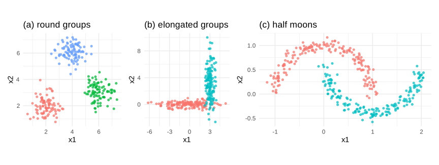
Figure 8.41: three shapes of data used to compare the clustering methods
The first set is the easy case that every method handles. The second punishes the algorithms that implicitly assume spherical groups. The third has clusters that are not convex at all, and it will separate the methods based on a distance to a centre from those based on density. We will bring the three of them back at the end of the section, side by side.
8.3.1 Gaussian mixture models
The most complete way of describing a group of observations is to give the law that generated them. The mixture model does exactly that: it assumes the data come from \(k\) normal distributions mixed in unknown proportions:
\[\begin{equation} f(x)=\sum_{j=1}^{k}\pi_j\,\mathcal{N}(x\mid\mu_j,\Sigma_j) \tag{8.45} \end{equation}\]
where \(\pi_j\) is the weight of the component \(j\), with \(\sum\pi_j=1\). Each component carries its own covariance matrix \(\Sigma_j\), so a cluster may be an ellipse of any size, elongation and orientation.
The parameters cannot be estimated directly, because we do not know which component produced which observation. The EM algorithm turns this difficulty into an alternation of two easy steps. In the E step we compute, for every observation, the probability that it comes from each component:
\[\begin{equation} \gamma_{ij}=\frac{\pi_j\,\mathcal{N}(x_i\mid\mu_j,\Sigma_j)}{\sum_{l=1}^{k}\pi_l\,\mathcal{N}(x_i\mid\mu_l,\Sigma_l)} \tag{8.46} \end{equation}\]
In the M step we re-estimate \(\pi_j\), \(\mu_j\) and \(\Sigma_j\) as weighted averages, using those probabilities as weights. Each pass increases the likelihood, and the process stops when it no longer moves.
Two features distinguish this approach from everything that follows. The assignment is soft: a point lying between two clusters is not forced into one of them, it receives a probability for each, and that probability is itself a useful output. And the model has a likelihood, so the number of components, and even the shape of the covariances, can be chosen by the \(BIC\) rather than by a geometric index.
In R:
suppressPackageStartupMessages(library(mclust))

gm_e <- Mclust(elong[, 1:2], G = 2, verbose = FALSE)
gm_b <- Mclust(blobs[, 1:2], G = 3, verbose = FALSE)

g_b <- ggplot(blobs, aes(x1, x2, colour = factor(gm_b$classification))) +
  geom_point(alpha = .7, size = 1.1) + coord_equal() +
  labs(title = paste0("round groups (", gm_b$modelName, ")")) +
  theme_minimal() + theme(legend.position = "none")

g_e <- ggplot(elong, aes(x1, x2, colour = factor(gm_e$classification))) +
  geom_point(alpha = .7, size = 1.1) + coord_equal() +
  labs(title = paste0("elongated groups (", gm_e$modelName, ")")) +
  theme_minimal() + theme(legend.position = "none")

g_b + g_e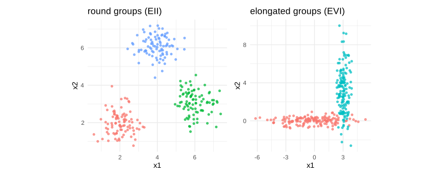
Figure 8.42: a mixture adapts the shape of each component
The code printed in the title is the covariance structure that the \(BIC\) selected, written with the convention of the package: three letters describing whether the volume, the shape and the orientation of the components are equal or free. On the elongated data the model chose a free orientation, which is what allowed it to follow the two directions.
The soft assignment can be displayed directly, and it is the clearest way to see what “probabilistic clustering” means.
unc <- data.frame(elong[, 1:2], uncertainty = gm_e$uncertainty)

ggplot(unc, aes(x1, x2, colour = uncertainty)) +
  geom_point(size = 1.6) +
  scale_colour_gradient(low = "grey85", high = "firebrick") +
  coord_equal() +
  labs(title = "points on the frontier are assigned with little confidence") +
  theme_minimal()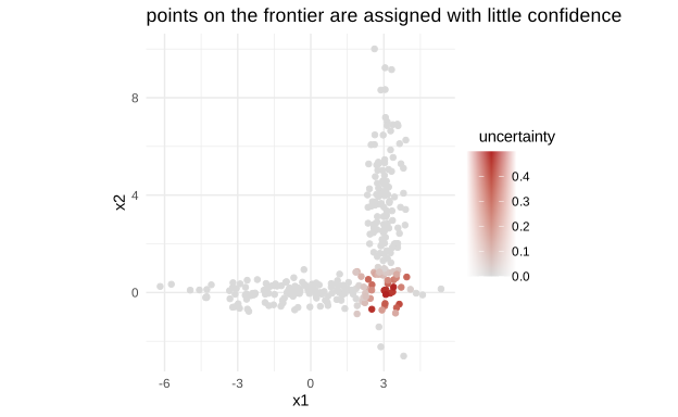
Figure 8.43: the uncertainty of the assignment, point by point
The dark points are those whose membership is doubtful, and they sit exactly where the two clouds overlap. No method based on a hard assignment can produce this information.
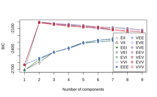
Figure 8.44: the BIC selects the number and the shape of the components
Each curve corresponds to one covariance structure, from the most constrained to the most free, and the horizontal axis gives the number of components. The maximum selects both at once.
8.3.2 K-means
K-means can be presented as the mixture model stripped of everything probabilistic: the covariances are forced to be spherical and identical, the proportions equal, and the soft assignment is replaced by a hard one. What remains is the minimization of the sum of the squared distances to the centres:
\[\begin{equation} \min_{C_1,...,C_k}\sum_{j=1}^{k}\sum_{x_i\in C_j}\lVert x_i-\mu_j\rVert^2 \tag{8.47} \end{equation}\]
The problem is combinatorial and cannot be solved exactly, so the algorithm of Lloyd alternates two steps until nothing moves: assign every point to the nearest centre, then recompute each centre as the mean of the points assigned to it. It is the same alternation as EM, in a degenerate form. Each step can only reduce the objective, which guarantees convergence, but only to a local minimum depending on the starting centres, which is why the procedure is restarted several times through the argument nstart.
Its simplicity makes it extremely fast, and this is why it remains the default choice on large data. Its three assumptions, however, are written in the formula: the squared Euclidean distance makes the groups implicitly spherical and of comparable size, the centre is a mean and is therefore sensitive to extreme points, and \(k\) must be given in advance.
In R:
set.seed(7)
pts <- as.matrix(blobs[, 1:2])
cent <- pts[sample(nrow(pts), 3), ]      # a deliberately poor start

steps <- list()
for (it in 1:4) {
  d <- as.matrix(dist(rbind(cent, pts)))[-(1:3), 1:3]
  lab <- factor(max.col(-d))
  steps[[it]] <- data.frame(blobs[, 1:2], lab = lab, it = paste("iteration", it),
                            cx = cent[lab, 1], cy = cent[lab, 2])
  cent <- t(sapply(1:3, function(j) colMeans(pts[lab == j, , drop = FALSE])))
}
sdf <- do.call(rbind, steps)

ggplot(sdf, aes(x1, x2, colour = lab)) +
  geom_point(alpha = .6, size = .9) +
  geom_point(aes(cx, cy), colour = "black", shape = 4, size = 3) +
  facet_wrap(~ it, nrow = 1) + coord_equal() +
  labs(title = "assign, recompute, repeat") +
  theme_minimal() + theme(legend.position = "none")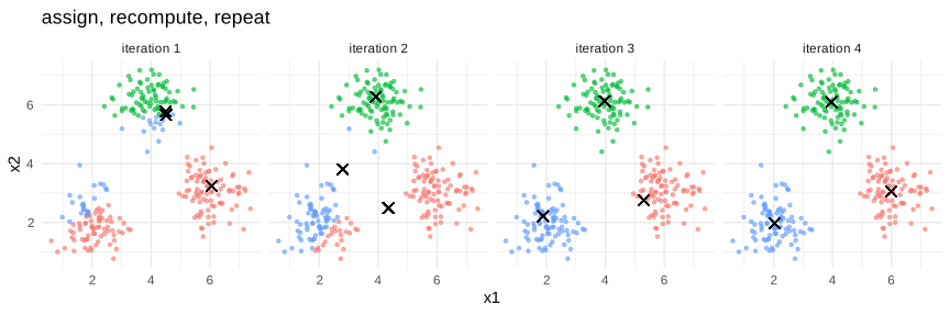
Figure 8.45: the first four iterations of the algorithm
The crosses are the centres. They start in a bad place and migrate towards the three groups within a couple of iterations, after which nothing changes. The convergence of this algorithm is usually very fast.
Applying it to the three data sets shows at once where it works and where it does not.
km_plot <- function(d, k, t) {
  set.seed(1)
  km <- kmeans(d[, 1:2], centers = k, nstart = 25)
  ggplot(d, aes(x1, x2, colour = factor(km$cluster))) +
    geom_point(alpha = .7, size = 1.1) +
    geom_point(data = as.data.frame(km$centers), aes(x1, x2),
               colour = "black", shape = 4, size = 3.5, inherit.aes = FALSE) +
    coord_equal() + labs(title = t) +
    theme_minimal() + theme(legend.position = "none")
}

km_plot(blobs, 3, "(a) correct") + km_plot(elong, 2, "(b) cuts across") +
  km_plot(moons, 2, "(c) fails")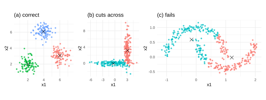
Figure 8.46: k-means on the three shapes
On the round groups it is perfect. On the elongated ones it cuts them across the middle instead of following their direction, because a sphere centred on a mean cannot describe a stretched cloud; this is exactly what the mixture of the previous section repaired. On the half moons it merely splits the plane in two, which has nothing to do with the structure of the data, and no choice of covariance would help: the problem there is the very idea of a centre.
8.3.3 K-mediods
K-medoids keeps the logic of K-means but replaces the mean by a medoid, that is an actual observation of the group, and it accepts any distance instead of the squared Euclidean one:
\[\begin{equation} \min_{m_1,...,m_k}\sum_{j=1}^{k}\sum_{x_i\in C_j}d(x_i,m_j) \tag{8.48} \end{equation}\]
Two consequences follow. The method becomes much more robust, since a medoid is a kind of multivariate median and an extreme point cannot drag it away. And it applies to data where a mean has no meaning, for instance categorical variables compared with a Gower distance, because it only ever needs the distances between observations and never their coordinates. Its cost is higher, which matters on large samples. The usual implementation is the algorithm PAM, partitioning around medoids.
In R:
set.seed(123)
poll <- rbind(blobs[, 1:2],
              data.frame(x1 = c(14, 15, 13.5, 14.5), x2 = c(14, 13, 15, 14)))

set.seed(1)
km_p  <- kmeans(poll, centers = 3, nstart = 25)
pam_p <- pam(poll, k = 3)

o1 <- ggplot(poll, aes(x1, x2, colour = factor(km_p$cluster))) +
  geom_point(alpha = .7, size = 1.1) +
  geom_point(data = as.data.frame(km_p$centers), aes(x1, x2), colour = "black",
             shape = 4, size = 3.5, inherit.aes = FALSE) +
  coord_equal() + labs(title = "k-means") +
  theme_minimal() + theme(legend.position = "none")

o2 <- ggplot(poll, aes(x1, x2, colour = factor(pam_p$clustering))) +
  geom_point(alpha = .7, size = 1.1) +
  geom_point(data = as.data.frame(pam_p$medoids), aes(x1, x2), colour = "black",
             shape = 4, size = 3.5, inherit.aes = FALSE) +
  coord_equal() + labs(title = "k-medoids (PAM)") +
  theme_minimal() + theme(legend.position = "none")

o1 + o2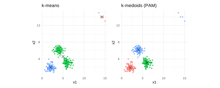
Figure 8.47: a handful of outliers moves a mean but not a medoid
Four points placed far away are enough to make K-means spend one of its three centres on them, and to merge two real groups in compensation. PAM resists better, because a medoid must be one of the observations and cannot drift into the empty space between the groups.
8.3.4 Hierarchical clustering
Hierarchical clustering does not ask for a number of groups. It builds a whole tree, the dendrogram, starting with every observation in its own cluster and merging, at each step, the two closest clusters, until only one remains. Cutting the tree at a chosen height then yields any number of groups we wish, which is a real practical advantage when \(k\) is unknown, and the tree itself carries information that a flat partition does not: it says which groups are close to which.
Everything depends on how the distance between two clusters is defined, the linkage:
single: the distance between the two closest members. It can follow elongated and irregular shapes, but it suffers from a chaining effect, where two groups are joined through a thin bridge of points.
complete: the distance between the two furthest members. It produces compact groups of similar diameter, and refuses to merge anything elongated.
average: the mean of all the pairwise distances, a compromise between the two.
Ward: merges the two clusters whose fusion increases the within group variance the least. It is the closest in spirit to K-means, and it is the default choice in most applications.
In R:
D_blob <- dist(blobs[, 1:2])

par(mfrow = c(2, 2), mar = c(1, 4, 2, 1))
for (m in c("single", "complete", "average", "ward.D2")) {
  plot(hclust(D_blob, method = m), labels = FALSE, hang = -1,
       main = paste("linkage:", m), xlab = "", sub = "")
}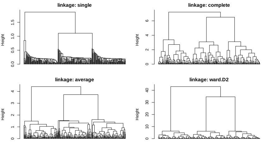
Figure 8.48: the same data, four linkages, four dendrograms
The height at which two branches join is the distance at which the clusters were merged, so a long vertical segment means that the two groups below it were far apart, and a good number of clusters is found by cutting where the vertical gaps are largest. The complete and Ward trees show three clear branches, whereas the single linkage tree is much more ragged: that difference is the chaining effect.
The choice of linkage is not cosmetic, as the half moons make clear.
D_moon <- dist(moons[, 1:2])
hc_plot <- function(m, t) {
  cl <- cutree(hclust(D_moon, method = m), k = 2)
  ggplot(moons, aes(x1, x2, colour = factor(cl))) +
    geom_point(alpha = .7, size = 1.1) + coord_equal() +
    labs(title = t) + theme_minimal() + theme(legend.position = "none")
}

hc_plot("single", "single") + hc_plot("complete", "complete") + hc_plot("ward.D2", "Ward")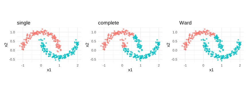
Figure 8.49: single linkage is the only one that follows the moons
Single linkage recovers the two moons exactly, because it only ever needs a chain of close neighbours to travel along a curved shape. Complete and Ward, which favour compact groups, cut the moons the way K-means did. Here the defect of single linkage has become its strength, which is a good reminder that none of these choices is better in the abstract.
8.3.5 DBSCAN
The three methods above all rely, in one way or another, on a distance to a centre, and all three failed on the half moons for that reason. DBSCAN abandons the idea of a centre altogether and reasons in terms of density.
Two parameters define it: a radius \(\varepsilon\) and a minimum count \(minPts\). An observation is a core point if at least \(minPts\) observations lie within a distance \(\varepsilon\) of it. Clusters are then grown by connecting core points that are within reach of one another, a border point is one that falls inside the radius of a core point without being one itself, and everything left over is labelled noise.
Three properties follow, and each of them is something the previous methods could not do. The number of clusters is not given in advance, it emerges from the density structure. The clusters may take any shape, since they grow by contiguity rather than around a centre. And outliers are identified explicitly instead of being forced into a group, which makes the method useful for detection as well as for clustering.
The price is the choice of \(\varepsilon\), to which the result is sensitive, and a genuine weakness when the clusters have very different densities, since one radius cannot suit them all.
In R:
suppressPackageStartupMessages(library(dbscan))

db_plot <- function(eps, t) {
  db <- dbscan(as.matrix(moons[, 1:2]), eps = eps, minPts = 5)
  dd <- data.frame(moons[, 1:2], cl = factor(db$cluster))
  ggplot(dd, aes(x1, x2, colour = cl)) +
    geom_point(alpha = .75, size = 1.1) + coord_equal() +
    labs(title = t, subtitle = paste(sum(db$cluster == 0), "points labelled noise")) +
    theme_minimal() + theme(legend.position = "none")
}

db_plot(0.10, "eps = 0.10 : too small") +
  db_plot(0.22, "eps = 0.22 : right") +
  db_plot(0.60, "eps = 0.60 : too large")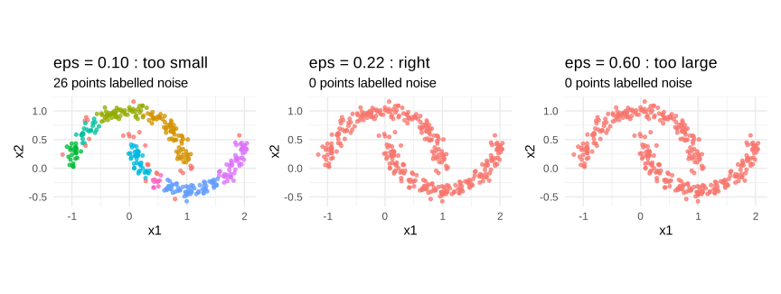
Figure 8.50: DBSCAN on the half moons, with three radii
With the right radius DBSCAN separates the two moons perfectly, which no centre based method managed. Too small a radius and almost everything becomes noise, because no point gathers enough neighbours to be a core point. Too large and the two moons merge, because the gap between them becomes dense enough to connect them.
The usual way of choosing \(\varepsilon\) is to plot, for every observation, the distance to its \(k\)-th nearest neighbour, sorted in increasing order. The height of the bend in that curve is the distance beyond which a point stops having close neighbours.
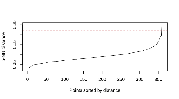
Figure 8.51: the k-nearest neighbour distance suggests the radius
The curve is flat over most of the sample and rises sharply at the end, and the dashed line marks the value used above.
In Python:
We have now seen five ways of clustering the same kind of data. Putting them on one grid, against the three shapes introduced at the beginning of the section, is the clearest possible summary.
if 'blobs_py' not in globals():
  blobs_py = r.blobs
if 'elong_py' not in globals():
  elong_py = r.elong
if 'moons_py' not in globals():
  moons_py = r.moons
from sklearn.cluster import KMeans, AgglomerativeClustering, DBSCAN
from sklearn.mixture import GaussianMixture
datasets = [("round", blobs_py, 3), ("elongated", elong_py, 2), ("moons", moons_py, 2)]
methods = ["k-means", "Ward", "single link", "gaussian mixture", "DBSCAN"]
fig, axes = plt.subplots(3, 5, figsize=(11, 6.5))
for i, (dname, dfr, k) in enumerate(datasets):
Z = dfr[["x1", "x2"]].to_numpy(dtype=float)
eps = {"round": 0.6, "elongated": 0.9, "moons": 0.22}[dname]
labs = [
KMeans(n_clusters=k, n_init=25, random_state=0).fit_predict(Z),
AgglomerativeClustering(n_clusters=k, linkage="ward").fit_predict(Z),
AgglomerativeClustering(n_clusters=k, linkage="single").fit_predict(Z),
GaussianMixture(n_components=k, covariance_type="full", random_state=0).fit_predict(Z),
DBSCAN(eps=eps, min_samples=5).fit_predict(Z),
]
for j, (ax, lab) in enumerate(zip(axes[i], labs)):
ax.scatter(Z[:, 0], Z[:, 1], c=lab, s=5, cmap="viridis")
ax.set_xticks([]); ax.set_yticks([])
if i == 0: ax.set_title(methods[j], fontsize=9)
if j == 0: ax.set_ylabel(dname, fontsize=9)#> <matplotlib.collections.PathCollection object at 0x0000020EB808A0F0>
#> []
#> []
#> Text(0.5, 1.0, 'k-means')
#> Text(0, 0.5, 'round')
#> <matplotlib.collections.PathCollection object at 0x0000020EB3EF5130>
#> []
#> []
#> Text(0.5, 1.0, 'Ward')
#> <matplotlib.collections.PathCollection object at 0x0000020EB3EF60F0>
#> []
#> []
#> Text(0.5, 1.0, 'single link')
#> <matplotlib.collections.PathCollection object at 0x0000020EB3A5ED50>
#> []
#> []
#> Text(0.5, 1.0, 'gaussian mixture')
#> <matplotlib.collections.PathCollection object at 0x0000020EB3A5C260>
#> []
#> []
#> Text(0.5, 1.0, 'DBSCAN')
#> <matplotlib.collections.PathCollection object at 0x0000020E9C823B30>
#> []
#> []
#> Text(0, 0.5, 'elongated')
#> <matplotlib.collections.PathCollection object at 0x0000020EB817CB60>
#> []
#> []
#> <matplotlib.collections.PathCollection object at 0x0000020EB817D400>
#> []
#> []
#> <matplotlib.collections.PathCollection object at 0x0000020EB3A5D9A0>
#> []
#> []
#> <matplotlib.collections.PathCollection object at 0x0000020EB3ECDD30>
#> []
#> []
#> <matplotlib.collections.PathCollection object at 0x0000020EB3A5D1F0>
#> []
#> []
#> Text(0, 0.5, 'moons')
#> <matplotlib.collections.PathCollection object at 0x0000020EB817E5A0>
#> []
#> []
#> <matplotlib.collections.PathCollection object at 0x0000020EB817EAE0>
#> []
#> []
#> <matplotlib.collections.PathCollection object at 0x0000020EB817F020>
#> []
#> []
#> <matplotlib.collections.PathCollection object at 0x0000020EB817F680>
#> []
#> []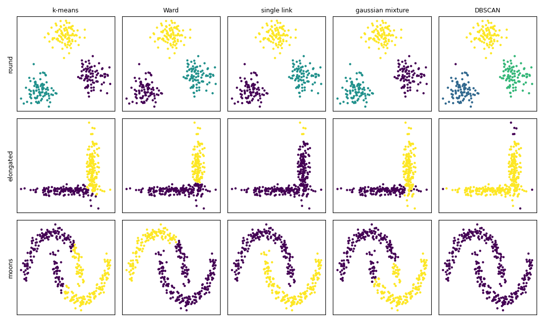
Figure 8.52: five clustering methods on three shapes, in python
This grid deserves to be read row by row. Every method succeeds on the first one, which is why an easy data set never tells us which algorithm to prefer. On the second, the mixture is clearly ahead, being the only one that models the orientation of a cloud. On the third, only single linkage and DBSCAN survive, and they are precisely the two that never compute a distance to a centre.
We now leave clustering for the second family of unsupervised methods, which do not group the observations but reduce the number of variables.
8.3.6 PCA method
Principal component analysis replaces the original variables by a smaller number of new ones, the components, built as linear combinations of the old ones and chosen so as to retain as much variance as possible.
The first component is the direction \(w_1\) maximizing the variance of the projected data:
\[\begin{equation} w_1=\arg\max_{\lVert w\rVert=1}Var(Xw)=\arg\max_{\lVert w\rVert=1}w^t\Sigma w \tag{8.49} \end{equation}\]
The solution is the eigenvector of the covariance matrix \(\Sigma\) associated with the largest eigenvalue. The second component is obtained in the same way among the directions orthogonal to the first, and so on. The eigenvalues give the variance carried by each component, so their share of the total is the proportion of information retained.
Two points govern the practice. The components are uncorrelated by construction, which makes PCA a natural remedy to the multicollinearity of the chapter on the assumptions on the regressors. And the method is not invariant to the units: a variable measured in a larger unit has a larger variance and dominates the first component. Unless all the variables share the same unit, PCA must be run on the correlation matrix, which amounts to standardizing them first.
In R:
set.seed(123)
n <- 300
f1 <- rnorm(n); f2 <- rnorm(n)
dat_pca <- data.frame(
  v1 =  1.0 * f1 + rnorm(n, sd = .35),
  v2 =  0.9 * f1 + rnorm(n, sd = .35),
  v3 =  0.8 * f1 + rnorm(n, sd = .35),
  v4 =  1.0 * f2 + rnorm(n, sd = .35),
  v5 =  0.9 * f2 + rnorm(n, sd = .35),
  v6 = rnorm(n, sd = 1))

pca <- prcomp(dat_pca, scale. = TRUE)
ev  <- pca$sdev^2
sc  <- data.frame(comp = seq_along(ev), eigenvalue = ev,
                  share = 100 * ev / sum(ev),
                  cum = 100 * cumsum(ev) / sum(ev))

s1 <- ggplot(sc, aes(comp, eigenvalue)) +
  geom_col(fill = "steelblue") + geom_line() + geom_point() +
  geom_hline(yintercept = 1, linetype = 2, colour = "firebrick") +
  labs(title = "scree plot", subtitle = "the Kaiser rule keeps the eigenvalues above 1",
       x = "component") + theme_minimal()

s2 <- ggplot(sc, aes(comp, cum)) +
  geom_col(fill = "steelblue") + geom_line() + geom_point() +
  geom_hline(yintercept = 80, linetype = 2, colour = "firebrick") +
  labs(title = "cumulative share of variance", y = "%", x = "component") +
  theme_minimal()

s1 + s2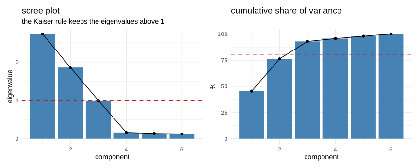
Figure 8.53: how much information each component carries
The data were built from two underlying factors plus one pure noise variable, and the scree plot shows exactly that: two eigenvalues clearly above one, then a drop. Three rules of thumb are used to decide how many components to keep, and they usually agree: the eigenvalues greater than one, the bend of the scree plot, and a target share of cumulative variance.
The biplot puts the observations and the variables on the same picture, and it is the most informative single plot of the method.
suppressPackageStartupMessages(library(factoextra))

fviz_pca_biplot(pca, label = "var", alpha.ind = .25,
                col.var = "firebrick", repel = TRUE,
                title = "biplot of the first two components")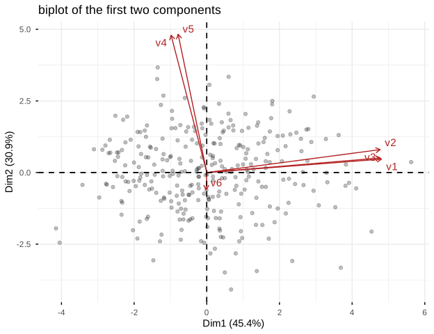
Figure 8.54: the biplot shows the observations and the variables together
The arrows are the original variables. Those that point in the same direction are strongly correlated, an arrow orthogonal to another indicates two uncorrelated variables, and the length of an arrow measures how well the variable is represented by the two components. Here the first three variables form one bundle and the next two another, which is the structure we simulated, while the noise variable is short and points elsewhere.
Because the components are simply a rotation, the original data can be reconstructed from a subset of them, and the quality of that reconstruction is a concrete way of seeing what was lost.
Z <- scale(dat_pca)
recon_err <- sapply(1:6, function(k) {
  approx_mat <- pca$x[, 1:k, drop = FALSE] %*% t(pca$rotation[, 1:k, drop = FALSE])
  mean((Z - approx_mat)^2)
})

ggplot(data.frame(k = 1:6, err = recon_err), aes(k, err)) +
  geom_line() + geom_point() +
  labs(title = "mean squared reconstruction error",
       x = "number of components kept", y = "error") +
  theme_minimal()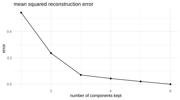
Figure 8.55: reconstruction of the data from a growing number of components
The error falls quickly over the first two components and then decreases slowly, which is the same message as the scree plot seen from the other side: beyond two components we are mostly reconstructing noise.
8.3.7 ICA method
Principal component analysis produces uncorrelated components. Independent component analysis asks for more: components that are statistically independent, which is a much stronger requirement, since the absence of correlation only concerns the second moment.
The model assumes that the observed variables are linear mixtures of unknown sources:
\[\begin{equation} x=As \quad \text{with the components of } s \text{ mutually independent} \tag{8.50} \end{equation}\]
and the algorithm looks for an unmixing matrix \(W\) such that \(\hat s=Wx\) has independent components. The key idea is that independence is obtained by maximizing non-gaussianity, measured by the kurtosis or by the negentropy. The intuition comes from the central limit theorem: a mixture of independent sources is more gaussian than the sources themselves, so moving away from the gaussian moves back towards the sources.
This is also the limitation of the method: if the sources really are gaussian, they cannot be recovered, because a rotation of gaussian variables is still gaussian and nothing distinguishes one direction from another. Two further indeterminacies remain in all cases, the order of the recovered sources and their scale, including their sign.
The classical illustration is the cocktail party problem: several microphones record mixtures of several voices, and we want the voices back.
In R:
suppressPackageStartupMessages(library(fastICA))

set.seed(1)
N <- 600
tt <- seq(0, 8, length.out = N)
S <- cbind(sine = sin(3 * tt),
           square = sign(sin(5 * tt)),
           saw = (tt %% 1.3) - 0.65)
A <- matrix(c(1, .7, .4, .3, 1, .6, .5, .2, 1), 3, 3)
Xmix <- S %*% A

ica <- fastICA(Xmix, n.comp = 3)
pcs <- prcomp(Xmix, scale. = FALSE)$x

long <- function(M, lab) {
  do.call(rbind, lapply(1:3, function(j)
    data.frame(t = tt, value = scale(M[, j]), sig = paste0("signal ", j), block = lab)))
}

allsig <- rbind(long(S, "1. true sources"),
                long(Xmix, "2. observed mixtures"),
                long(pcs, "3. recovered by PCA"),
                long(ica$S, "4. recovered by ICA"))
allsig$block <- factor(allsig$block, levels = unique(allsig$block))

ggplot(allsig, aes(t, value)) +
  geom_line(linewidth = .35) +
  facet_grid(block ~ sig, scales = "free_y") +
  labs(title = "ICA separates the sources, PCA does not", x = "", y = "") +
  theme_minimal() + theme(axis.text.y = element_blank())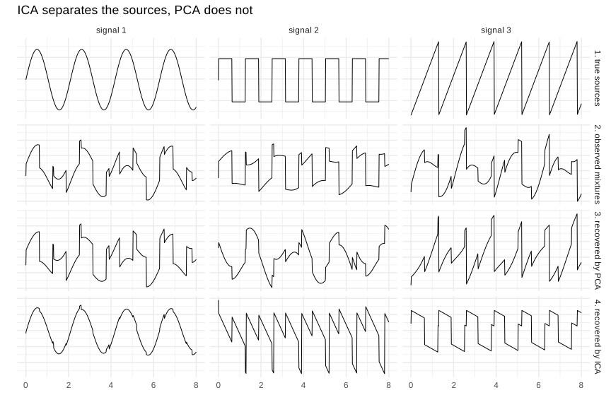
Figure 8.56: three sources, their mixtures, and what PCA and ICA recover
The four rows tell the whole story. The first shows the three original signals, a sine, a square wave and a sawtooth. The second shows what the microphones record, three mixtures in which nothing is recognizable. The third shows the principal components: they are uncorrelated, and they order the variance correctly, but each of them is still a mixture. The fourth shows the independent components, in which the three original shapes reappear, up to a permutation and a change of sign.
This contrast is the clearest way to understand what the two methods actually optimize. PCA looks for the directions that carry the most variance; ICA looks for the directions that are the least gaussian. On this problem only the second question has the sources as its answer.
8.3.8 Factor analysis
Factor analysis resembles principal component analysis, and the two are often confused, but they answer opposite questions.
PCA is descriptive: the components are built from the variables, and with all of them the reconstruction is exact. Factor analysis is a model: it assumes that unobservable factors cause the observed variables, and that each variable also contains a part specific to itself:
\[\begin{equation} x=\Lambda f+\varepsilon \tag{8.51} \end{equation}\]
where \(f\) is the vector of common factors, \(\Lambda\) the matrix of loadings, and \(\varepsilon\) the specific parts, assumed uncorrelated with each other. The variance of each variable splits accordingly into a communality, the share explained by the common factors, and a uniqueness, which belongs to the variable alone.
The practical difference is that PCA tries to reproduce the total variance while factor analysis tries to reproduce only the covariances between the variables, leaving the specific variance aside. When one asks whether a set of indicators measures a small number of underlying traits, the second formulation is the right one.
A second feature of the model is that \(\Lambda\) is determined only up to a rotation, since replacing \(\Lambda\) by \(\Lambda R\) and \(f\) by \(R^tf\) with \(R\) orthogonal leaves the model unchanged. This indeterminacy is turned into an advantage: a rotation is chosen to make the loadings easy to read, the most common being the varimax rotation, which pushes each loading towards zero or one so that each variable belongs clearly to one factor.
In R:
set.seed(123)
n <- 400
g1 <- rnorm(n); g2 <- rnorm(n)
ind <- data.frame(
  i1 = .85 * g1 + rnorm(n, sd = .5), i2 = .80 * g1 + rnorm(n, sd = .5),
  i3 = .75 * g1 + rnorm(n, sd = .5), i4 = .70 * g1 + rnorm(n, sd = .5),
  i5 = .85 * g2 + rnorm(n, sd = .5), i6 = .80 * g2 + rnorm(n, sd = .5),
  i7 = .75 * g2 + rnorm(n, sd = .5), i8 = .70 * g2 + rnorm(n, sd = .5))

fa <- factanal(ind, factors = 2, rotation = "varimax")

load_df <- as.data.frame(unclass(fa$loadings))
load_df$indicator <- rownames(load_df)
load_long <- reshape(load_df, direction = "long",
                     varying = list(names(load_df)[1:2]),
                     v.names = "loading", timevar = "factor",
                     times = names(load_df)[1:2], idvar = "indicator")

ggplot(load_long, aes(factor, indicator, fill = loading)) +
  geom_tile(colour = "white") +
  geom_text(aes(label = round(loading, 2)), size = 3) +
  scale_fill_gradient2(low = "firebrick", mid = "white", high = "steelblue",
                       midpoint = 0, limits = c(-1, 1)) +
  labs(title = "loadings after a varimax rotation") +
  theme_minimal()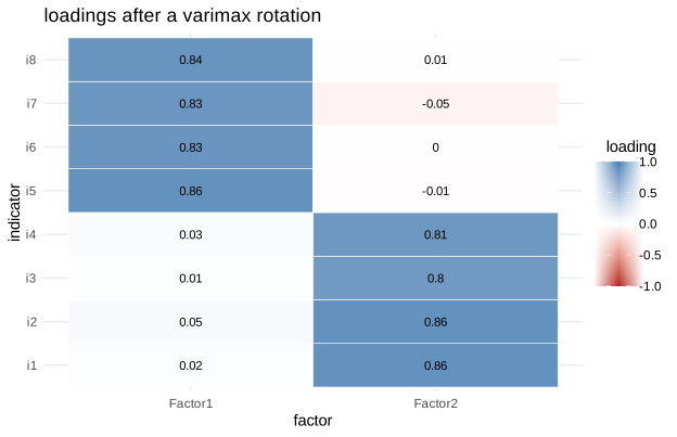
Figure 8.57: the loadings show which indicator belongs to which factor
The block structure is immediate: the first four indicators load on one factor and the last four on the other, each with a loading close to zero on the factor that does not concern it. This is the pattern we simulated, and the varimax rotation is what makes it so readable.
# communality = share of the variance of each indicator explained by the factors
comm <- data.frame(indicator = names(fa$uniquenesses),
                   uniqueness = as.numeric(fa$uniquenesses),
communality = 1 - as.numeric(fa$uniquenesses))| indicator | uniqueness | communality |
|---|---|---|
| i1 | 0.256 | 0.744 |
| i2 | 0.258 | 0.742 |
| i3 | 0.359 | 0.641 |
| i4 | 0.336 | 0.664 |
| i5 | 0.255 | 0.745 |
| i6 | 0.303 | 0.697 |
| i7 | 0.313 | 0.687 |
| i8 | 0.295 | 0.705 |
The two columns sum to one for every indicator. An indicator with a low communality is poorly explained by the common factors and contributes little to the construct being measured, which is exactly the diagnostic a questionnaire designer is looking for.
The model also comes with a formal test, unusual among the methods of this chapter, of the hypothesis that the chosen number of factors is sufficient to reproduce the observed correlations.
#> number of factors tested : 2#> p-value of the test : 0.0526The p-value obtained here sits just above the conventional five per cent, so the hypothesis that two factors are enough is not rejected, but only barely. A borderline result of this kind should be reported as borderline rather than presented as a confirmation: it says that the data are compatible with two factors, not that two factors have been established.
Two further cautions apply to this test. It assumes normal variables, and it is known to reject very easily on large samples, because with enough observations even a negligible gap between the observed correlations and those reproduced by the model becomes statistically significant. On a sample of several thousand it will almost always call for more factors than are substantively useful, which is why it is read together with the loadings and the communalities rather than on its own.
8.3.9 Latend dirichlet allocation
Latent Dirichlet allocation applies the same idea of latent structure to text. It is a generative model of documents, and the easiest way to state it is to describe how it pretends a document was written:
each topic is a probability distribution over the words of the vocabulary: a topic about finance gives a high probability to bank, rate and credit;
each document is a probability distribution over the topics: an article may be seventy per cent finance and thirty per cent statistics;
to produce each word of a document, we draw a topic from the distribution of the document, then a word from the distribution of that topic.
The two distributions are given Dirichlet priors, which is where the name comes from. What we observe are only the words; the topics and the proportions are latent and must be recovered.
Two consequences deserve to be stated. A document belongs to several topics at once with weights, not to a single cluster, which makes this a soft and multi-membership method. And a word can belong to several topics, which is how the model handles ambiguity. The number of topics, however, is fixed by the user, exactly like the \(k\) of the clustering methods.
To see it work we build a small artificial corpus with three known themes and check that the model finds them.
In R:
# tm is used through tm:: rather than attached: it exports an annotate()
# that would mask the one of ggplot2 for the rest of the book.
suppressPackageStartupMessages(library(topicmodels))

set.seed(1)
vocab <- c("bank","rate","credit","market","price",
           "model","data","sample","estimate","test",
           "plant","water","soil","seed","grow")

make_doc <- function(p, len = 60) {
  w <- sample(vocab, len, replace = TRUE, prob = p)
  table(factor(w, levels = vocab))
}
p_fin  <- c(rep(.16, 5), rep(.02, 5), rep(.02, 5))
p_stat <- c(rep(.02, 5), rep(.16, 5), rep(.02, 5))
p_bot  <- c(rep(.02, 5), rep(.02, 5), rep(.16, 5))

corpus <- rbind(t(sapply(1:20, function(i) make_doc(p_fin))),
                t(sapply(1:20, function(i) make_doc(p_stat))),
                t(sapply(1:20, function(i) make_doc(p_bot))))
colnames(corpus) <- vocab

dtm <- tm::as.DocumentTermMatrix(corpus, weighting = tm::weightTf)
lda_fit <- LDA(dtm, k = 3, control = list(seed = 1))

top_terms <- as.data.frame(terms(lda_fit, 5))| Topic 1 | Topic 2 | Topic 3 |
|---|---|---|
| bank | water | test |
| rate | plant | data |
| price | soil | sample |
| market | grow | estimate |
| credit | seed | model |
The three columns separate cleanly into a financial vocabulary, a statistical one and a botanical one. The model was never told that three themes existed, nor which words belonged together; it inferred that from the co-occurrences alone. Note that the numbering of the topics is arbitrary, exactly as the numbering of clusters was.
gam <- as.data.frame(posterior(lda_fit)$topics)
names(gam) <- paste("topic", 1:3)
gam$doc <- 1:nrow(gam)
gam$truth <- rep(c("finance", "statistics", "botany"), each = 20)

gl <- reshape(gam, direction = "long",
              varying = list(names(gam)[1:3]), v.names = "gamma",
              timevar = "topic", times = names(gam)[1:3], idvar = "doc")

ggplot(gl, aes(doc, gamma, fill = topic)) +
  geom_col(width = 1) +
  facet_wrap(~ truth, scales = "free_x") +
  labs(title = "each document is a mixture of topics",
       x = "document", y = "proportion") +
  theme_minimal()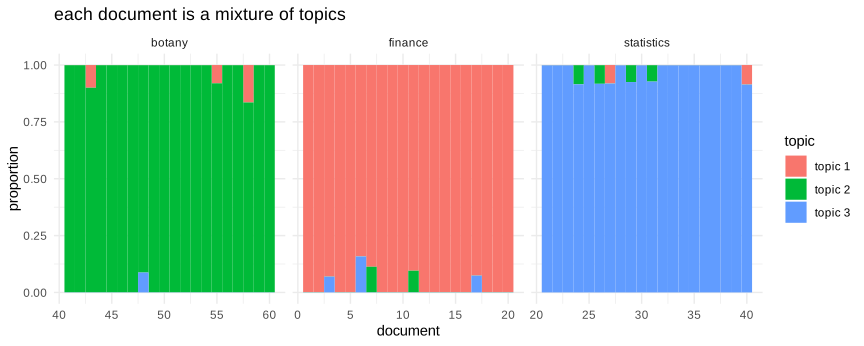
Figure 8.58: the composition of each document in terms of topics
Each bar is one document, divided according to its topic proportions. Within each true group one topic dominates, which is what we built, and the small remaining slices are the words that the sampling happened to draw from the other vocabularies.
8.3.10 Manifold learning
All the reduction methods above are linear: the new variables are linear combinations of the old ones. When the data lie along a curved surface embedded in a higher dimensional space, such a projection necessarily destroys the structure, because it can only look at the cloud from a fixed angle.
The manifold hypothesis states that high dimensional data often live on a surface of much lower dimension. The classical illustration is the Swiss roll: a two dimensional sheet rolled up in three dimensions. Two points may be very close in the ambient space while being far apart along the sheet, and this is precisely what a linear projection cannot see.
Several families of methods address this. Isomap replaces the Euclidean distance by the distance measured along a graph of nearest neighbours, which approximates the distance on the surface. t-SNE and UMAP take a different approach: they build a probability of neighbourhood in the original space and look for a two dimensional configuration reproducing those neighbourhoods, which makes them excellent for visualization.
In R:
suppressPackageStartupMessages(library(Rtsne))

set.seed(1)
n <- 800
th <- (3 * pi / 2) * (1 + 2 * runif(n))
hh <- 21 * runif(n)
roll <- cbind(x = th * cos(th), y = hh, z = th * sin(th))
pos <- th          # position along the sheet, used only for the colours

pc_roll <- prcomp(roll)$x[, 1:2]
ts_roll <- Rtsne(roll, perplexity = 30, verbose = FALSE,
                 check_duplicates = FALSE)$Y

r1 <- ggplot(data.frame(x = roll[, 1], z = roll[, 3], pos),
             aes(x, z, colour = pos)) +
  geom_point(size = .8) + coord_equal() +
  scale_colour_viridis_c() +
  labs(title = "the roll seen from above") +
  theme_minimal() + theme(legend.position = "none")

r2 <- ggplot(data.frame(pc1 = pc_roll[, 1], pc2 = pc_roll[, 2], pos),
             aes(pc1, pc2, colour = pos)) +
  geom_point(size = .8) +
  scale_colour_viridis_c() +
  labs(title = "PCA : the colours stay mixed") +
  theme_minimal() + theme(legend.position = "none")

r3 <- ggplot(data.frame(d1 = ts_roll[, 1], d2 = ts_roll[, 2], pos),
             aes(d1, d2, colour = pos)) +
  geom_point(size = .8) +
  scale_colour_viridis_c() +
  labs(title = "t-SNE : the colours are ordered") +
  theme_minimal() + theme(legend.position = "none")

r1 + r2 + r3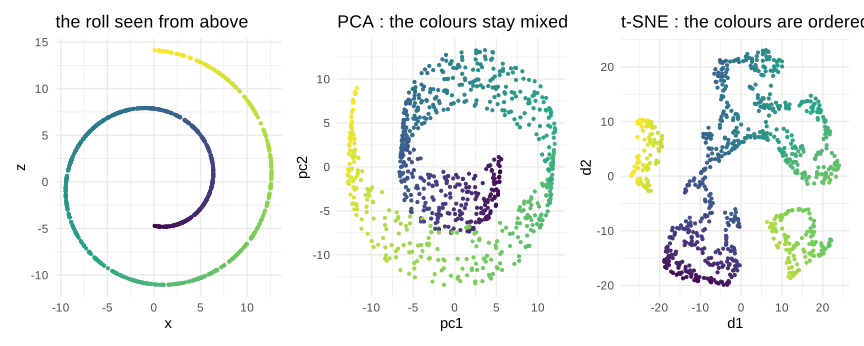
Figure 8.59: a Swiss roll: PCA flattens it, t-SNE unrolls it
The colour encodes the position along the rolled sheet, so a successful reduction should produce a smooth colour gradient. PCA gives a projection in which distant parts of the sheet are superimposed and the colours interleave, because it can only take a linear photograph of the object. t-SNE produces a configuration in which the gradient is respected: points that were neighbours on the sheet remain neighbours.
These methods must be read with caution. In a t-SNE or UMAP plot, the distances between clusters have no meaning, nor do their sizes, and the shapes depend on parameters such as the perplexity. Two well separated groups on the picture may be close in reality, and conversely. They are visualization tools, excellent for suggesting a structure, and they should not be used to measure one, still less as features for a later model.
In Python:
scikit-learn gathers the linear and non linear methods in the modules decomposition and manifold, which makes it easy to put four of them side by side on the same roll.
from sklearn.datasets import make_swiss_roll
from sklearn.decomposition import PCA, FastICA
from sklearn.manifold import TSNE, Isomap

Xr, color = make_swiss_roll(n_samples=800, noise=0.05, random_state=1)

reducers = {
    "PCA": PCA(n_components=2).fit_transform(Xr),
    "ICA": FastICA(n_components=2, random_state=1, max_iter=1000).fit_transform(Xr),
    "Isomap": Isomap(n_neighbors=10, n_components=2).fit_transform(Xr),
    "t-SNE": TSNE(n_components=2, perplexity=30, random_state=1, init="pca").fit_transform(Xr),
}

fig, axes = plt.subplots(1, 4, figsize=(11, 3))
for ax, (name, Y) in zip(axes, reducers.items()):
    ax.scatter(Y[:, 0], Y[:, 1], c=color, s=5, cmap="viridis")
    ax.set_title(name, fontsize=10)
    ax.set_xticks([]); ax.set_yticks([])
#> <matplotlib.collections.PathCollection object at 0x0000020EB8119670>
#> Text(0.5, 1.0, 'PCA')
#> []
#> []
#> <matplotlib.collections.PathCollection object at 0x0000020EB81EAF00>
#> Text(0.5, 1.0, 'ICA')
#> []
#> []
#> <matplotlib.collections.PathCollection object at 0x0000020EB81EB8F0>
#> Text(0.5, 1.0, 'Isomap')
#> []
#> []
#> <matplotlib.collections.PathCollection object at 0x0000020EB81EBF20>
#> Text(0.5, 1.0, 't-SNE')
#> []
#> []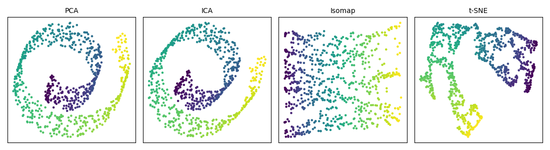
Figure 8.60: four reductions of the Swiss roll in python
The two linear methods, on the left, keep the roll folded: whatever the criterion they optimize, variance for one and non-gaussianity for the other, they remain restricted to a projection. The two manifold methods, on the right, unfold it, Isomap by respecting the distances measured along the surface and t-SNE by respecting the neighbourhoods. The colour gradient is the quickest way to judge the result.