8.2 Supervided learning models
We now go through the main supervised algorithms. To keep the comparison meaningful we use only two data sets throughout this section.
The first one is a regression problem built so that most of the predictors are useless: thirty variables, of which only five really enter the data generating process, and a sample barely larger than the number of variables. This is the situation in which the ordinary least squares behave worst and in which regularization shows its value.
The second one is a two dimensional classification problem, deliberately kept in two dimensions so that every decision boundary can be drawn. Being able to see what an algorithm does is worth many paragraphs of description, and this is the reason for that choice.
In R:
set.seed(123)

# ---- data set 1 : regression with many useless predictors
n_tr <- 120; p <- 30
X  <- matrix(rnorm(n_tr * p), n_tr, p)
colnames(X) <- paste0("v", 1:p)
beta_true <- c(3, -2, 1.5, 2.5, -1.8, rep(0, p - 5))   # only 5 are relevant
y_reg <- as.numeric(X %*% beta_true + rnorm(n_tr, sd = 2))

Xte <- matrix(rnorm(400 * p), 400, p); colnames(Xte) <- colnames(X)
y_reg_te <- as.numeric(Xte %*% beta_true + rnorm(400, sd = 2))

# ---- data set 2 : two dimensional classification, non linear boundary
m <- 400
r  <- sqrt(runif(m, 0, 1)) * 3
th <- runif(m, 0, 2 * pi)
inner <- data.frame(x1 = r * cos(th), x2 = r * sin(th), class = "A")
r2 <- sqrt(runif(m, 0.55, 1)) * 6
th2 <- runif(m, 0, 2 * pi)
outer_ring <- data.frame(x1 = r2 * cos(th2), x2 = r2 * sin(th2), class = "B")
clf <- rbind(inner, outer_ring)
clf$class <- factor(clf$class)
set.seed(1); ii <- sample(nrow(clf), 0.7 * nrow(clf))
clf_tr <- clf[ii, ]; clf_te <- clf[-ii, ]

b1 <- ggplot(data.frame(beta = beta_true, v = 1:p), aes(v, beta)) +
  geom_col(fill = "steelblue") +
  labs(title = "regression: the true coefficients",
       subtitle = "25 of the 30 are exactly zero", x = "variable") +
  theme_minimal()

b2 <- ggplot(clf, aes(x1, x2, colour = class, shape = class)) +
  geom_point(alpha = .6, size = 1.2) +
  coord_equal() +
  labs(title = "classification: a boundary no line can draw") +
  theme_minimal() + theme(legend.position = "bottom")

b1 + b2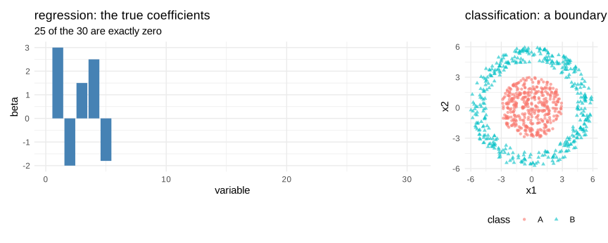
Figure 8.20: the two data sets used in this section
The second panel is deliberately hostile to linear methods: no straight line can separate a disc from the ring that surrounds it. We will see which algorithms cope with it and which do not.
To draw the boundaries we need a small helper that evaluates a fitted model on a fine grid and colours the plane. It is written once and reused for every classifier of this section.
# draws the decision regions of any model that has a predict method
plot_boundary <- function(model, data, title, type = "class", ...) {
  gx <- seq(min(data$x1) - .5, max(data$x1) + .5, length.out = 220)
  gy <- seq(min(data$x2) - .5, max(data$x2) + .5, length.out = 220)
  grid <- expand.grid(x1 = gx, x2 = gy)
  pr <- predict(model, newdata = grid, ...)
  if (is.list(pr) && !is.data.frame(pr)) pr <- pr$class
  if (is.matrix(pr) || is.data.frame(pr)) pr <- colnames(pr)[max.col(pr)]
  grid$pred <- factor(as.character(pr))
  ggplot() +
    geom_raster(data = grid, aes(x1, x2, fill = pred), alpha = .28) +
    geom_point(data = data, aes(x1, x2, colour = class, shape = class),
               size = 1.1, alpha = .75) +
    coord_equal() + labs(title = title) +
    theme_minimal() + theme(legend.position = "none")
}
8.2.1 Linear regression
The starting point is the model of the first chapters, fitted by minimizing the sum of the squared residuals:
\[\begin{equation} \hat\beta_{OLS}=\arg\min_{\beta}\sum_{i=1}^{n}\big(y_i-x_i^t\beta\big)^2=(X^tX)^{-1}X^ty \tag{8.30} \end{equation}\]
Seen from the machine learning side, its virtue is that it has no tuning parameter and its weakness is that it has no way of protecting itself. When the predictors are numerous relative to the sample, or strongly correlated, the matrix \(X^tX\) becomes ill conditioned, the variance of the estimator explodes, and the coefficients take large values of alternating signs that cancel each other on the training set but not outside it.
In R:
dtr <- data.frame(y = y_reg, X)
ols <- lm(y ~ ., data = dtr)

pred_ols <- as.numeric(cbind(1, Xte) %*% coef(ols))
mse_ols  <- mean((y_reg_te - pred_ols)^2)

cat("number of coefficients :", length(coef(ols)) - 1, "\n")
#> number of coefficients : 30#> training MSE : 2.685#> test MSE : 5.06The gap between the two errors is the overfitting we described earlier, and with thirty predictors for a hundred and twenty observations it is already substantial. The three models that follow attack exactly this problem.
8.2.2 Ridge regresson
Ridge regression adds to the objective a penalty proportional to the sum of the squared coefficients:
\[\begin{equation} \hat\beta_{ridge}=\arg\min_{\beta}\left\{\sum_{i=1}^{n}\big(y_i-x_i^t\beta\big)^2+\lambda\sum_{j=1}^{p}\beta_j^2\right\} \tag{8.31} \end{equation}\]
and admits a closed form, \(\hat\beta_{ridge}=(X^tX+\lambda I)^{-1}X^ty\). Adding \(\lambda\) to the diagonal makes the matrix invertible even when \(X^tX\) is not, which is the original motivation of the method.
The parameter \(\lambda\) governs the strength of the shrinkage. At \(\lambda=0\) we recover the least squares, and as \(\lambda\) grows all the coefficients are pulled towards zero, without ever reaching it exactly. Ridge therefore reduces the variance at the cost of a bias, and it keeps all the variables in the model. It is the right tool when the predictors are correlated and we believe that all of them contribute a little.
Note that the penalty is not invariant to the scale of the variables, so the predictors must be standardized before fitting, which the usual packages do by default.
In R:
suppressPackageStartupMessages(library(glmnet))

ridge_fit <- glmnet(X, y_reg, alpha = 0)
cv_ridge  <- cv.glmnet(X, y_reg, alpha = 0)

par(mfrow = c(1, 2))
plot(ridge_fit, xvar = "lambda", label = FALSE)
title("coefficient paths", line = 2.5)
abline(v = log(cv_ridge$lambda.min), lty = 2)
plot(cv_ridge)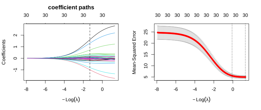
Figure 8.21: the ridge path: every coefficient shrinks, none reaches zero
On the left every curve is the trajectory of one coefficient as the penalty increases from right to left. They all converge smoothly towards zero but none of them touches it. On the right the cross validation curve shows the usual U shape, and the dashed line marks the value of \(\lambda\) that minimizes the error.
8.2.3 Lasso regression
The lasso replaces the squared penalty by the sum of the absolute values:
\[\begin{equation} \hat\beta_{lasso}=\arg\min_{\beta}\left\{\sum_{i=1}^{n}\big(y_i-x_i^t\beta\big)^2+\lambda\sum_{j=1}^{p}\lvert\beta_j\rvert\right\} \tag{8.32} \end{equation}\]
This apparently small change has a large consequence: the lasso sets some coefficients exactly to zero, and therefore performs a selection of the variables at the same time as the estimation. There is no closed form, and the solution is obtained by a coordinate descent algorithm.
The reason for this difference is geometric, and it is worth a picture. Both methods minimize the same sum of squares under a constraint on the size of the coefficients, a disc for ridge and a square rotated by forty five degrees for the lasso. The solution is the point where the elliptical contours of the sum of squares first touch the constraint region, and the square has corners lying exactly on the axes.
In R:
# contours of the sum of squares around the OLS solution
b_ols <- c(1.6, 1.0)
gr <- expand.grid(b1 = seq(-2.2, 2.6, length.out = 260),
                  b2 = seq(-2.2, 2.6, length.out = 260))
gr$rss <- 2.2 * (gr$b1 - b_ols[1])^2 + 1.0 * (gr$b1 - b_ols[1]) * (gr$b2 - b_ols[2]) +
          1.6 * (gr$b2 - b_ols[2])^2

tt <- seq(0, 2 * pi, length.out = 300)
circle <- data.frame(b1 = 1.05 * cos(tt), b2 = 1.05 * sin(tt))
diamond <- data.frame(b1 = c(1.05, 0, -1.05, 0, 1.05), b2 = c(0, 1.05, 0, -1.05, 0))

base <- function(shape, title, sol) {
  ggplot() +
    geom_contour(data = gr, aes(b1, b2, z = rss),
                 bins = 11, colour = "grey65", linewidth = .35) +
    geom_polygon(data = shape, aes(b1, b2), fill = "steelblue", alpha = .25,
                 colour = "steelblue") +
    geom_point(aes(b_ols[1], b_ols[2]), colour = "grey30", size = 2) +
    annotate("text", x = b_ols[1] + .1, y = b_ols[2] + .28, label = "OLS", size = 3) +
    geom_point(aes(sol[1], sol[2]), colour = "firebrick", size = 3) +
    geom_hline(yintercept = 0, linewidth = .3) + geom_vline(xintercept = 0, linewidth = .3) +
    coord_equal() + labs(title = title, x = expression(beta[1]), y = expression(beta[2])) +
    theme_minimal()
}

g_ridge <- base(circle,  "Ridge : the disc has no corner",        c(0.92, 0.50))
g_lasso <- base(diamond, "Lasso : the corner sits on the axis",  c(1.05, 0.00))

g_ridge + g_lasso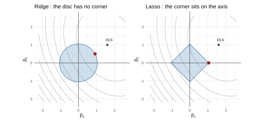
Figure 8.22: why the lasso produces zeros and ridge does not
On the left the ellipse meets the disc at a point where both coordinates are non zero. On the right it meets the square at a corner, where the second coefficient is exactly zero. As the dimension grows the corners become edges and faces, and this is why the lasso eliminates many variables at once.
lasso_fit <- glmnet(X, y_reg, alpha = 1)
cv_lasso  <- cv.glmnet(X, y_reg, alpha = 1)

par(mfrow = c(1, 2))
plot(lasso_fit, xvar = "lambda", label = FALSE)
title("coefficient paths", line = 2.5)
abline(v = log(cv_lasso$lambda.min), lty = 2)
plot(cv_lasso)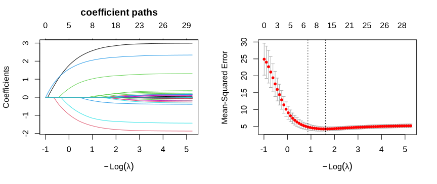
Figure 8.23: the lasso path: coefficients reach zero one after the other
Compared with the ridge path, the curves here hit zero and stay there, and the number written along the top axis of the plot counts the variables still alive. At the selected \(\lambda\) roughly a third of them remain.
sel <- coef(cv_lasso, s = "lambda.min")
kept <- rownames(sel)[which(as.numeric(sel) != 0)]
kept <- setdiff(kept, "(Intercept)")

cat("variables kept by the lasso :", paste(kept, collapse = ", "), "\n")
#> variables kept by the lasso : v1, v2, v3, v4, v5, v6, v8, v9, v10, v11, v15, v21, v23#> truly relevant variables : v1, v2, v3, v4, v5The lasso keeps all five relevant variables and discards two thirds of the noise, but it also retains a number of variables whose true coefficient is zero. This is the normal behaviour of the \(\lambda\) that minimizes the cross validated error: it is chosen to predict well, not to select correctly, and it errs on the generous side. When the goal is really the selection, the usual practice is to take the largest \(\lambda\) whose error stays within one standard error of the minimum, available as lambda.1se, which gives a distinctly sparser model at almost no cost in accuracy.
8.2.4 Elastic net regression
The two penalties have complementary defects. The lasso, faced with a group of strongly correlated predictors, tends to keep one of them arbitrarily and to drop the others, which makes the selection unstable from one sample to the next. Ridge keeps them all but never produces a sparse model. The elastic net combines both:
\[\begin{equation} \hat\beta_{net}=\arg\min_{\beta}\left\{\sum_{i=1}^{n}\big(y_i-x_i^t\beta\big)^2+\lambda\left(\alpha\sum_{j=1}^{p}\lvert\beta_j\rvert+\frac{1-\alpha}{2}\sum_{j=1}^{p}\beta_j^2\right)\right\} \tag{8.33} \end{equation}\]
The mixing parameter \(\alpha\) moves continuously from ridge, at \(\alpha=0\), to the lasso, at \(\alpha=1\). The quadratic part encourages correlated variables to enter or leave together, an effect known as the grouping effect, while the absolute part keeps the ability to produce exact zeros.
In practice \(\alpha\) is chosen by cross validation like \(\lambda\), on a small grid of values.
In R:
alphas <- c(0, 0.25, 0.5, 0.75, 1)
res_net <- do.call(rbind, lapply(alphas, function(a) {
  cvf <- cv.glmnet(X, y_reg, alpha = a)
  pr  <- as.numeric(predict(cvf, newx = Xte, s = "lambda.min"))
  data.frame(alpha = a, test_mse = mean((y_reg_te - pr)^2),
             nonzero = sum(as.numeric(coef(cvf, s = "lambda.min"))[-1] != 0))
}))

comp_reg <- rbind(
  data.frame(model = "OLS", test_mse = mse_ols, nonzero = p),
  data.frame(model = paste0("elastic net (alpha=", res_net$alpha, ")"),
             test_mse = res_net$test_mse, nonzero = res_net$nonzero))
comp_reg$model[comp_reg$model == "elastic net (alpha=0)"] <- "ridge"
comp_reg$model[comp_reg$model == "elastic net (alpha=1)"] <- "lasso"

ggplot(comp_reg, aes(reorder(model, test_mse), test_mse)) +
  geom_col(fill = "steelblue") +
  geom_text(aes(label = paste0(nonzero, " vars")), hjust = -0.1, size = 3) +
  coord_flip(clip = "off") +
  labs(title = "test error and number of variables retained",
       x = "", y = "test MSE") +
  theme_minimal()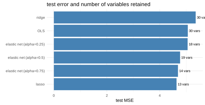
Figure 8.24: test error of the four regressions
| model | test_mse | nonzero |
|---|---|---|
| OLS | 5.060 | 30 |
| ridge | 5.357 | 30 |
| elastic net (alpha=0.25) | 5.052 | 18 |
| elastic net (alpha=0.5) | 4.768 | 19 |
| elastic net (alpha=0.75) | 4.688 | 14 |
| lasso | 4.634 | 13 |
The result deserves a careful reading, because it is not the one a summary would predict. The lasso and the intermediate values of \(\alpha\) do beat the ordinary least squares, but ridge does not: it lands slightly above the unpenalized fit. This is not an accident of the simulation, it follows from the way we built the data. Twenty five of the thirty coefficients are exactly zero, and ridge is structurally unable to set anything to zero: it can only shrink the useless coefficients towards it, so it keeps paying for them. The lasso, which removes them outright, is in its ideal situation. The lesson is that no penalty dominates the others in general, and that the right choice depends on whether the truth is sparse. The second column tells the same story from the other side: the same or better accuracy is obtained with a fraction of the variables.
In Python:
The three models exist in scikit-learn under the names Ridge, Lasso and ElasticNet, with cross validated versions whose names end in CV.
if 'Xtr_py' not in globals():
  Xtr_py = r.X
if 'ytr_py' not in globals():
  ytr_py = r.y_reg
if 'Xte_py' not in globals():
  Xte_py = r.Xte
if 'yte_py' not in globals():
  yte_py = r.y_reg_te
from sklearn.linear_model import LinearRegression, RidgeCV, LassoCV, ElasticNetCV
from sklearn.preprocessing import StandardScaler
from sklearn.pipeline import make_pipeline

Xa = np.asarray(Xtr_py, dtype=float); ya = np.asarray(ytr_py, dtype=float)
Xb = np.asarray(Xte_py, dtype=float); yb = np.asarray(yte_py, dtype=float)

def mse(m):
    return round(float(np.mean((yb - m.predict(Xb)) ** 2)), 3)

def nz(m):
    est = m[-1] if hasattr(m, "steps") else m
    return int(np.sum(np.abs(est.coef_) > 1e-8))

models = {
    "OLS":        LinearRegression().fit(Xa, ya),
    "ridge":      make_pipeline(StandardScaler(), RidgeCV(alphas=np.logspace(-3, 3, 50))).fit(Xa, ya),
    "lasso":      make_pipeline(StandardScaler(), LassoCV(cv=5, random_state=0, max_iter=5000)).fit(Xa, ya),
    "elastic net": make_pipeline(StandardScaler(), ElasticNetCV(l1_ratio=[.25, .5, .75], cv=5,
                                                               random_state=0, max_iter=5000)).fit(Xa, ya),
}

reg_comp_py = pd.DataFrame([{"model": k, "test_mse": mse(v), "nonzero": nz(v)}
for k, v in models.items()])| model | test_mse | nonzero |
|---|---|---|
| OLS | 5.060 | 30 |
| ridge | 5.342 | 30 |
| lasso | 4.622 | 14 |
| elastic net | 4.885 | 17 |
The ordering of the models is the same as in R.
8.2.5 Linear discriminant analysis
We now move to the classification data set, the disc surrounded by a ring, and we draw the decision boundary of each algorithm on it.
Linear discriminant analysis takes a generative point of view. Instead of modelling directly the probability of the class given the features, it models how the features are distributed inside each class, and then inverts the reasoning with the Bayes rule:
\[\begin{equation} P(y=k\mid x)=\frac{\pi_k f_k(x)}{\sum_{l}\pi_l f_l(x)} \tag{8.34} \end{equation}\]
where \(\pi_k\) is the proportion of the class \(k\) and \(f_k\) the density of the features inside it. The specific assumption of the LDA is that each \(f_k\) is a normal density, and above all that all the classes share the same covariance matrix \(\Sigma\). Under this assumption the quadratic terms cancel when we compare two classes, and the boundary that remains is linear:
\[\begin{equation} \delta_k(x)=x^t\Sigma^{-1}\mu_k-\frac{1}{2}\mu_k^t\Sigma^{-1}\mu_k+\ln\pi_k \tag{8.35} \end{equation}\]
The observation is assigned to the class with the largest \(\delta_k\). The method is simple, has no tuning parameter, and behaves remarkably well when the sample is small, because it estimates very few quantities. Its limit is written in its own assumption: if the classes do not share the same covariance, or if the boundary is not linear, it cannot work.
In R:
suppressPackageStartupMessages(library(MASS))

lda_fit <- lda(class ~ x1 + x2, data = clf_tr)
plot_boundary(lda_fit, clf_te, "LDA")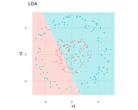
Figure 8.25: linear discriminant analysis on a boundary that is not linear
The result is a failure, and it is instructive. The algorithm does what it was asked to do, it draws the best straight line, but no straight line separates a disc from a ring. Its accuracy will be close to that of a model answering the majority class.
8.2.6 Quadratic discriminant analysis
Quadratic discriminant analysis relaxes the assumption that caused the problem: each class keeps its own covariance matrix \(\Sigma_k\). The quadratic terms no longer cancel, and the boundary becomes a conic section, an ellipse, a parabola or a hyperbola:
\[\begin{equation} \delta_k(x)=-\frac{1}{2}\ln\lvert\Sigma_k\rvert-\frac{1}{2}(x-\mu_k)^t\Sigma_k^{-1}(x-\mu_k)+\ln\pi_k \tag{8.36} \end{equation}\]
The gain in flexibility is paid in parameters: instead of one covariance matrix we estimate \(k\) of them, that is \(k\frac{p(p+1)}{2}\) numbers, which becomes unreasonable as soon as the number of features grows. This is the bias variance trade-off of the previous section, met here in a very concrete form.
Our data are made for this model. The inner disc and the outer ring have the same centre but very different dispersions, which is exactly a difference of covariance.
In R:
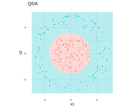
Figure 8.26: quadratic discriminant analysis recovers a circular boundary
The boundary is now an ellipse, very close to the circle that generated the data, and the two classes are correctly separated. Moving from LDA to QDA changed nothing in the algorithm except one assumption, and that assumption was the whole problem.
8.2.7 Support vector machine
The support vector machine starts from a different idea. Among all the boundaries that separate the classes, it looks for the one that leaves the largest margin, that is the widest empty corridor on each side. Only the points sitting on the edge of that corridor matter, and they are called the support vectors; the others could be removed without changing anything.
In the separable case the problem is written:
\[\begin{equation} \min_{w,b}\frac{1}{2}\lVert w\rVert^2 \quad \text{subject to} \quad y_i(w^tx_i+b)\geqslant 1 \tag{8.37} \end{equation}\]
Real data are rarely separable, so slack variables are introduced to allow some violations, penalized by a cost \(C\):
\[\begin{equation} \min_{w,b,\xi}\frac{1}{2}\lVert w\rVert^2+C\sum_{i=1}^{n}\xi_i \quad \text{subject to} \quad y_i(w^tx_i+b)\geqslant 1-\xi_i,\ \xi_i\geqslant 0 \tag{8.38} \end{equation}\]
A small \(C\) tolerates many violations and gives a wide, smooth margin, a large \(C\) refuses them and produces a boundary that hugs the data. This is again the same trade-off, under yet another name.
The second idea of the method is the kernel trick. The dual form of the problem involves the observations only through their scalar products \(x_i^tx_j\), so replacing that product by a kernel function \(K(x_i,x_j)\) amounts to working in a much richer space without ever computing the coordinates in it. The radial kernel:
\[\begin{equation} K(x_i,x_j)=\exp\big(-\gamma\lVert x_i-x_j\rVert^2\big) \tag{8.39} \end{equation}\]
corresponds to a space of infinite dimension, and allows boundaries of almost any shape.
In R:
suppressPackageStartupMessages(library(e1071))

svm_lin <- svm(class ~ x1 + x2, data = clf_tr, kernel = "linear", cost = 1)
svm_rbf <- svm(class ~ x1 + x2, data = clf_tr, kernel = "radial", cost = 1)

plot_boundary(svm_lin, clf_te, "SVM, linear kernel") +
  plot_boundary(svm_rbf, clf_te, "SVM, radial kernel")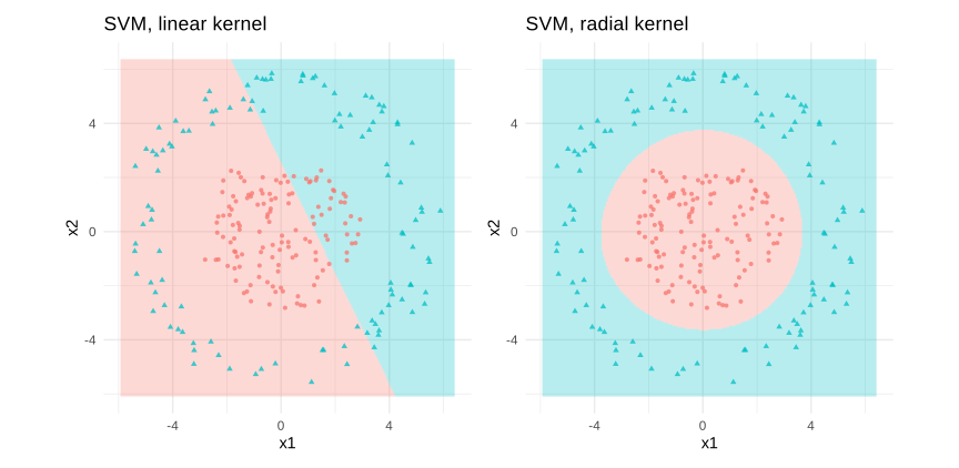
Figure 8.27: the same SVM with a linear and a radial kernel
The left panel fails exactly like the LDA, and for the same reason. The right panel, with a single change of argument, draws a closed curve around the inner disc. Nothing else was modified: the kernel alone changed the family of boundaries the algorithm was allowed to consider.
The effect of the cost is worth seeing as well, because it is the parameter most often tuned in practice.
s1 <- svm(class ~ x1 + x2, data = clf_tr, kernel = "radial", cost = 0.01)
s2 <- svm(class ~ x1 + x2, data = clf_tr, kernel = "radial", cost = 100)

plot_boundary(s1, clf_te, "cost = 0.01 : smooth, may underfit") +
  plot_boundary(s2, clf_te, "cost = 100 : follows the points closely")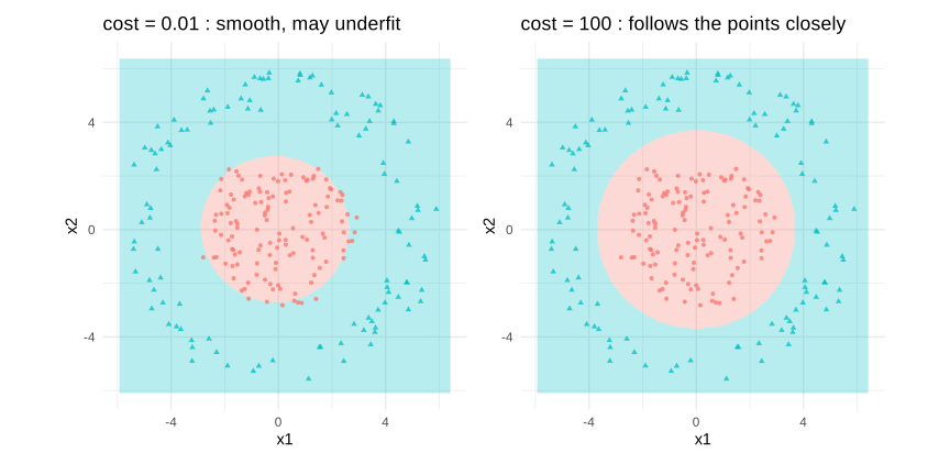
Figure 8.28: the cost controls how closely the boundary follows the data
8.2.8 Naive bayes model
The naive Bayes classifier returns to the generative formula (8.34), but makes a drastic simplification: inside a class, the features are assumed independent of one another. The joint density then factorizes into a product of univariate densities:
\[\begin{equation} P(y=k\mid x)\propto \pi_k\prod_{j=1}^{p}f_{kj}(x_j) \tag{8.40} \end{equation}\]
The assumption is almost always false, hence the name. Its merit is that it replaces the estimation of a multivariate density by that of \(p\) univariate densities, which is enormously cheaper and remains feasible when \(p\) is very large. This is why the method survives in text classification, where the features are word counts running into the tens of thousands.
Curiously, the classifier often performs well even when the independence is violated, because the decision only requires the ranking of the probabilities to be right, not their values.
In R:
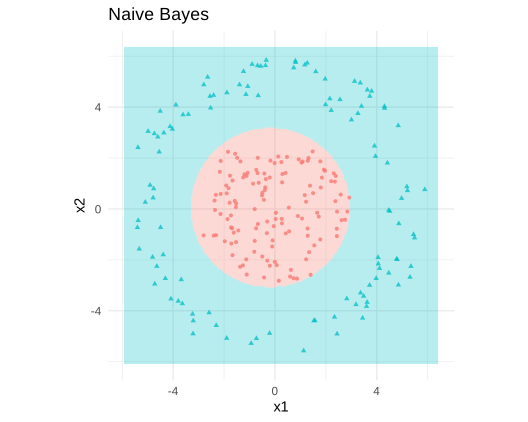
Figure 8.29: naive Bayes on the ring data
Here the independence assumption is in fact satisfied by construction, since the two coordinates were drawn independently, and the boundary the method produces is a reasonable closed curve.
8.2.9 K-nearest neighors
The nearest neighbours method holds the record for simplicity: it stores the training set, and to classify a new point it looks at the \(k\) closest observations and takes a majority vote. There is no equation to estimate, no parameter to fit, and the whole model is the data. For this reason it is called a lazy, or memory based, method.
Everything depends on \(k\). With \(k=1\) each training point rules its immediate neighbourhood, the boundary is extremely jagged and the training error is exactly zero, which is the perfect illustration of overfitting. As \(k\) grows the vote involves more neighbours, the boundary becomes smoother, and beyond a certain point the method underfits.
Two practical warnings. The distance is computed on the raw features, so the variables must be standardized, otherwise the one measured in the largest unit dominates the calculation. And the method degrades quickly when the number of features grows, because in high dimension all the points become almost equidistant, a phenomenon known as the curse of dimensionality.
In R:
suppressPackageStartupMessages(library(class))

knn_boundary <- function(k, title) {
  gx <- seq(min(clf_te$x1) - .5, max(clf_te$x1) + .5, length.out = 180)
  gy <- seq(min(clf_te$x2) - .5, max(clf_te$x2) + .5, length.out = 180)
  grid <- expand.grid(x1 = gx, x2 = gy)
  grid$pred <- knn(train = clf_tr[, c("x1", "x2")], test = grid,
                   cl = clf_tr$class, k = k)
  ggplot() +
    geom_raster(data = grid, aes(x1, x2, fill = pred), alpha = .28) +
    geom_point(data = clf_te, aes(x1, x2, colour = class, shape = class),
               size = 1.1, alpha = .75) +
    coord_equal() + labs(title = title) +
    theme_minimal() + theme(legend.position = "none")
}

knn_boundary(1, "k = 1 : jagged, overfits") +
  knn_boundary(35, "k = 35 : smooth")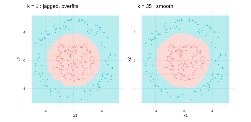
Figure 8.30: the number of neighbours controls the smoothness of the boundary
The left boundary is visibly irregular: it follows individual points, including those that are only noise. The right one is regular and much closer to the circle that generated the data. The value of \(k\) plays exactly the role that the degree of the polynomial played in the section on overfitting, and it is chosen the same way, by cross validation.
ks <- c(1, 3, 5, 9, 15, 25, 35, 55, 85)
acc <- sapply(ks, function(k) {
  pr <- knn(clf_tr[, c("x1", "x2")], clf_te[, c("x1", "x2")], clf_tr$class, k = k)
  mean(pr == clf_te$class)
})

ggplot(data.frame(k = ks, accuracy = acc), aes(k, accuracy)) +
  geom_line() + geom_point() +
  geom_vline(xintercept = ks[which.max(acc)], linetype = 2, colour = "firebrick") +
  labs(title = "test accuracy against the number of neighbours") +
  theme_minimal()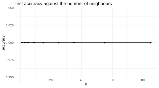
Figure 8.31: choosing k by cross validation
8.2.10 stochastic gradient descent
Stochastic gradient descent is not a model but an optimization method, and it deserves its place here because it is what makes the large scale models of the next chapter possible at all.
Minimizing the empirical risk of equation (8.1) by an ordinary gradient descent requires, at each step, to go through the whole sample in order to compute one gradient:
\[\begin{equation} \beta^{(t+1)}=\beta^{(t)}-\eta\,\frac{1}{n}\sum_{i=1}^{n}\nabla_\beta L\big(y_i,f_\beta(x_i)\big) \tag{8.41} \end{equation}\]
With millions of observations this is unaffordable. The stochastic version replaces the full sum by a single observation, or by a small batch, drawn at random:
\[\begin{equation} \beta^{(t+1)}=\beta^{(t)}-\eta\,\nabla_\beta L\big(y_i,f_\beta(x_i)\big) \tag{8.42} \end{equation}\]
Each step is then extremely cheap, but noisy, since the gradient of one observation is only an unbiased estimate of the true gradient. The trajectory wanders instead of descending cleanly, and the learning rate \(\eta\) must decrease over time for the algorithm to settle. That noise is not only a cost: it helps the method escape from poor local minima, which matters a great deal for the neural networks of the next chapter.
In R:
We implement the two versions by hand on a simple linear regression, which is the clearest way to see the difference in their trajectories.
set.seed(123)
nn <- 400
xg <- rnorm(nn); yg <- 1.5 + 2.5 * xg + rnorm(nn, sd = 1)
Xg <- cbind(1, xg)

grad_desc <- function(stochastic, steps = 60, eta = 0.35) {
  b <- c(-1, -1); path <- matrix(b, 1, 2)
  for (s in 1:steps) {
    if (stochastic) {
      i <- sample(nn, 8)                       # a small batch
      g <- -2 * t(Xg[i, ]) %*% (yg[i] - Xg[i, ] %*% b) / length(i)
    } else {
      g <- -2 * t(Xg) %*% (yg - Xg %*% b) / nn  # the whole sample
    }
    b <- b - eta * g / (1 + 0.03 * s)
    path <- rbind(path, as.numeric(b))
  }
  data.frame(b0 = path[, 1], b1 = path[, 2], step = 0:steps)
}

set.seed(1)
pb <- cbind(grad_desc(FALSE), type = "batch")
ps <- cbind(grad_desc(TRUE),  type = "stochastic")
paths <- rbind(pb, ps)

gg <- expand.grid(b0 = seq(-1.5, 3, length.out = 120),
                  b1 = seq(-1.5, 3.5, length.out = 120))
gg$rss <- apply(gg, 1, function(z) mean((yg - Xg %*% c(z[1], z[2]))^2))

ggplot() +
  geom_contour(data = gg, aes(b0, b1, z = rss), bins = 25,
               colour = "grey75", linewidth = .3) +
  geom_path(data = paths, aes(b0, b1, colour = type), linewidth = .8) +
  geom_point(aes(1.5, 2.5), colour = "firebrick", size = 3, shape = 4) +
  labs(title = "the two trajectories in the space of the coefficients",
       subtitle = "the cross marks the true values",
       x = expression(beta[0]), y = expression(beta[1])) +
  theme_minimal()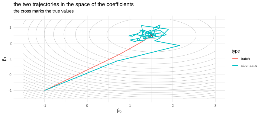
Figure 8.32: batch and stochastic descent towards the same minimum
The batch trajectory is smooth and heads almost straight for the minimum. The stochastic one zigzags, because every step is computed on eight observations only, and yet it reaches the same neighbourhood after the same number of steps, having done a fraction of the work. This is the whole argument of the method.
In Python:
The five classifiers above exist in scikit-learn, and the following block fits them on the same data and compares them on the test set.
if 'clf_tr_py' not in globals():
  clf_tr_py = r.clf_tr
if 'clf_te_py' not in globals():
  clf_te_py = r.clf_te
from sklearn.discriminant_analysis import (LinearDiscriminantAnalysis,
                                           QuadraticDiscriminantAnalysis)
from sklearn.svm import SVC
from sklearn.naive_bayes import GaussianNB
from sklearn.neighbors import KNeighborsClassifier
from sklearn.linear_model import SGDClassifier
from sklearn.metrics import accuracy_score

Xtr_c = clf_tr_py[["x1", "x2"]].to_numpy(dtype=float)
ytr_c = clf_tr_py["class"].to_numpy()
Xte_c = clf_te_py[["x1", "x2"]].to_numpy(dtype=float)
yte_c = clf_te_py["class"].to_numpy()

classifiers = {
    "LDA": LinearDiscriminantAnalysis(),
    "QDA": QuadraticDiscriminantAnalysis(),
    "SVM linear": SVC(kernel="linear", C=1),
    "SVM radial": SVC(kernel="rbf", C=1),
    "Naive Bayes": GaussianNB(),
    "KNN (k=35)": KNeighborsClassifier(n_neighbors=35),
    "SGD (linear)": SGDClassifier(loss="hinge", random_state=0, max_iter=2000),
}

clf_scores = pd.DataFrame(
    [{"model": k, "test_accuracy": round(accuracy_score(yte_c, m.fit(Xtr_c, ytr_c).predict(Xte_c)), 4)}
     for k, m in classifiers.items()]
).sort_values("test_accuracy", ascending=False).reset_index(drop=True)| model | test_accuracy |
|---|---|
| SVM radial | 1.0000 |
| KNN (k=35) | 1.0000 |
| QDA | 0.9958 |
| Naive Bayes | 0.9958 |
| SVM linear | 0.6542 |
| SGD (linear) | 0.6042 |
| LDA | 0.4250 |
The table sorts the models by accuracy and confirms what the pictures showed. The four methods able to draw a curved boundary are at the top, three of them essentially perfect. The purely linear ones collapse, and the LDA does something worth noticing: with two balanced classes a coin flip scores \(0.5\), and the LDA scores below that. This is not a bug. A single straight line across two concentric clouds cuts both of them, and the side it assigns to each class is decided by the estimated means, which are almost identical here; the rule it settles on is therefore slightly worse than useless. A model can be worse than chance, and when that happens it usually means its assumptions are not merely imprecise but structurally wrong for the data. The problem was built that way on purpose, and the ranking would be entirely different on data with a linear boundary: there is no best algorithm in the abstract, only algorithms whose assumptions fit, or do not fit, the problem at hand.
fig, axes = plt.subplots(2, 3, figsize=(10, 6))
gx, gy = np.meshgrid(np.linspace(Xte_c[:, 0].min() - .5, Xte_c[:, 0].max() + .5, 200),
                     np.linspace(Xte_c[:, 1].min() - .5, Xte_c[:, 1].max() + .5, 200))
grid = np.c_[gx.ravel(), gy.ravel()]
show = ["LDA", "QDA", "SVM linear", "SVM radial", "Naive Bayes", "KNN (k=35)"]

for ax, name in zip(axes.ravel(), show):
    mdl = classifiers[name]
    zz = (mdl.predict(grid) == "B").astype(int).reshape(gx.shape)
    ax.contourf(gx, gy, zz, alpha=.25, levels=1)
    for cl, mk in zip(["A", "B"], ["o", "^"]):
        sub = Xte_c[yte_c == cl]
        ax.scatter(sub[:, 0], sub[:, 1], s=6, marker=mk, alpha=.7)
    ax.set_title(name, fontsize=9)
    ax.set_xticks([]); ax.set_yticks([])
#> <matplotlib.contour.QuadContourSet object at 0x0000020E9C811EB0>
#> <matplotlib.collections.PathCollection object at 0x0000020E9CB63920>
#> <matplotlib.collections.PathCollection object at 0x0000020E9CA9D910>
#> Text(0.5, 1.0, 'LDA')
#> []
#> []
#> <matplotlib.contour.QuadContourSet object at 0x0000020EB3AEC6B0>
#> <matplotlib.collections.PathCollection object at 0x0000020E9C5A2F00>
#> <matplotlib.collections.PathCollection object at 0x0000020E98BF1310>
#> Text(0.5, 1.0, 'QDA')
#> []
#> []
#> <matplotlib.contour.QuadContourSet object at 0x0000020E9C80AE10>
#> <matplotlib.collections.PathCollection object at 0x0000020E9C5A1BE0>
#> <matplotlib.collections.PathCollection object at 0x0000020E98BF2BA0>
#> Text(0.5, 1.0, 'SVM linear')
#> []
#> []
#> <matplotlib.contour.QuadContourSet object at 0x0000020E9C7FD2E0>
#> <matplotlib.collections.PathCollection object at 0x0000020E9C550B00>
#> <matplotlib.collections.PathCollection object at 0x0000020E9CCBEC60>
#> Text(0.5, 1.0, 'SVM radial')
#> []
#> []
#> <matplotlib.contour.QuadContourSet object at 0x0000020E98BF1A30>
#> <matplotlib.collections.PathCollection object at 0x0000020E9C520CB0>
#> <matplotlib.collections.PathCollection object at 0x0000020E9C5231A0>
#> Text(0.5, 1.0, 'Naive Bayes')
#> []
#> []
#> <matplotlib.contour.QuadContourSet object at 0x0000020E9CB33CB0>
#> <matplotlib.collections.PathCollection object at 0x0000020E9C522F00>
#> <matplotlib.collections.PathCollection object at 0x0000020E9C5A0650>
#> Text(0.5, 1.0, 'KNN (k=35)')
#> []
#> []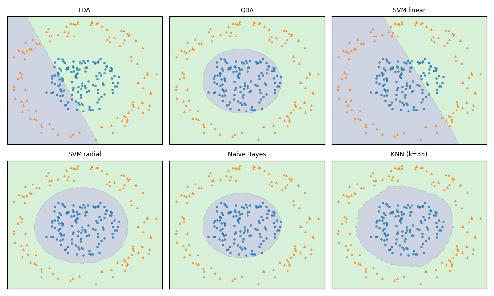
Figure 8.33: the decision boundaries of six classifiers in python
Seeing the six boundaries side by side is the best summary of this section. The same data, the same two features, and six very different answers, each of them the direct consequence of the assumptions written into the algorithm.
8.2.11 Decision trees
A decision tree asks a sequence of simple questions about the features and follows the answers down to a leaf, which carries the prediction. Its great merit is that the resulting rule can be read and explained to anyone, which is rare in this chapter, and it is the reason why trees remain popular in fields where a decision must be justified.
The tree is grown greedily. At each node the algorithm examines every variable and every possible split point, and keeps the one that makes the two resulting groups as pure as possible. For classification the purity of a node is usually measured by the Gini index or by the entropy:
\[\begin{align} Gini&=\sum_{k=1}^{K}p_k(1-p_k) \\ Entropy&=-\sum_{k=1}^{K}p_k\ln p_k \tag{8.43} \end{align}\]
where \(p_k\) is the proportion of the class \(k\) in the node. Both are zero when the node contains a single class and maximal when the classes are equally mixed. For regression the same role is played by the within node variance.
Left alone, the algorithm grows until every leaf is pure, which means it memorizes the training set: a tree is an overfitting machine by construction. It must therefore be pruned, by requiring a minimum number of observations in a node, limiting the depth, or penalizing the number of leaves by a complexity parameter chosen by cross validation.
In R:
suppressPackageStartupMessages({library(rpart); library(rpart.plot)})

tree_fit <- rpart(class ~ x1 + x2, data = clf_tr, method = "class",
                  control = rpart.control(cp = 0.01))

par(mfrow = c(1, 1))
rpart.plot(tree_fit, type = 2, extra = 104, box.palette = "GnBu",
           main = "the rule the tree has learned")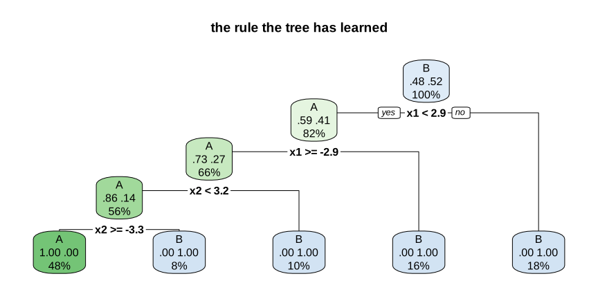
Figure 8.34: the fitted tree and the boundary it produces
Each box shows the question, the proportion of each class and the share of the sample that reaches it. The rule can be read aloud: it is a sequence of thresholds on the two coordinates.
deep <- rpart(class ~ x1 + x2, data = clf_tr, method = "class",
              control = rpart.control(cp = 0.0005, minsplit = 2))

plot_boundary(tree_fit, clf_te, "pruned tree", type = "class") +
  plot_boundary(deep, clf_te, "unpruned tree : overfitting")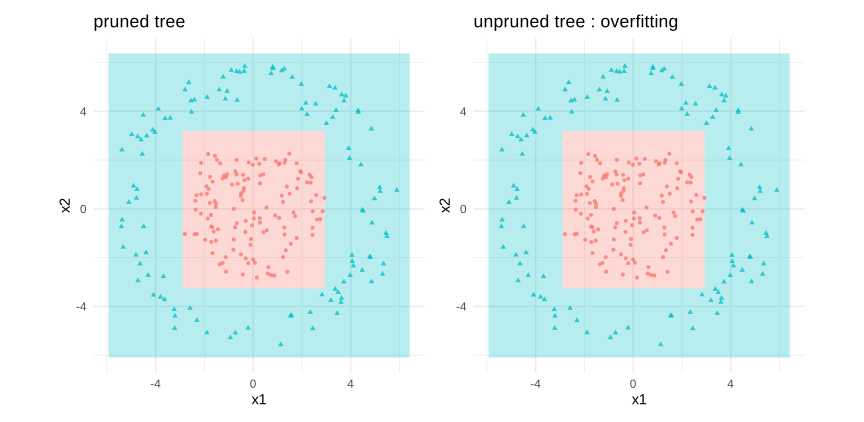
Figure 8.35: a tree draws a boundary made of rectangles
This picture shows both the strength and the weakness of the method. The boundary is made exclusively of horizontal and vertical segments, because each split concerns one variable at a time, so a circle can only be approximated by a staircase. And on the right, with the pruning switched off, the staircase becomes absurdly detailed and starts chasing individual points.
set.seed(123)
big_tree <- rpart(class ~ x1 + x2, data = clf_tr, method = "class",
                  control = rpart.control(cp = 0.0001, xval = 10))
plotcp(big_tree)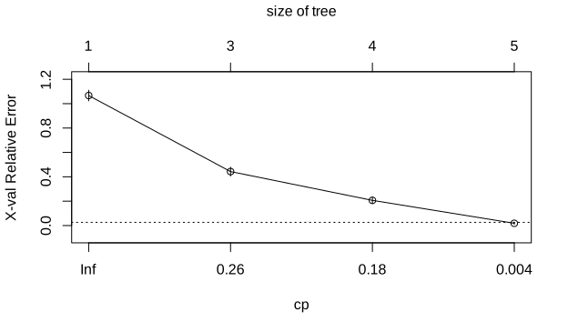
Figure 8.36: cross validation chooses where to prune
The curve gives the cross validated error against the complexity parameter, and the usual rule is to take the smallest tree whose error lies within one standard error of the minimum, marked by the dotted line.
8.2.12 Random foreset
A single tree has a serious defect: it is unstable. Changing a few observations can modify a split near the root and change the whole structure below it. In the language of the bias variance decomposition, a tree has low bias and very high variance.
The random forest attacks the variance directly by averaging many trees, and it makes them as different from one another as possible using two sources of randomness:
bagging: each tree is grown on a bootstrap sample drawn with replacement from the training set;
random subspace: at each node, only a random subset of \(m\) variables is considered for the split, instead of all \(p\).
The second point is the specific contribution of the method. Without it, a very predictive variable would be chosen first by almost every tree, and the trees would be strongly correlated, which limits the benefit of averaging. Restricting the choice forces the trees to explore other variables and decorrelates them. The usual default is \(m=\sqrt{p}\) for classification.
The bootstrap has a useful side effect. Each tree leaves aside roughly a third of the observations, which are said to be out of bag, and predicting each observation with only the trees that did not see it gives an honest error estimate for free, without any separate validation set.
In R:
suppressPackageStartupMessages(library(randomForest))

set.seed(123)
rf_fit <- randomForest(class ~ x1 + x2, data = clf_tr, ntree = 500)

plot_boundary(tree_fit, clf_te, "one tree") +
  plot_boundary(rf_fit, clf_te, "500 trees averaged")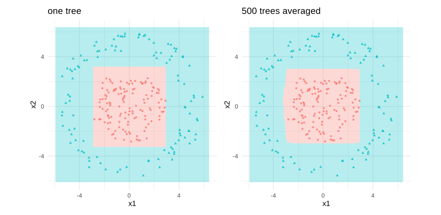
Figure 8.37: the forest smooths the staircase of a single tree
The boundary of the forest is still built from rectangles, since every tree is, but averaging five hundred of them produces a curve that is much closer to the true circle. This is the visual translation of the reduction in variance.
oob <- data.frame(trees = 1:nrow(rf_fit$err.rate), oob = rf_fit$err.rate[, "OOB"])

ggplot(oob, aes(trees, oob)) +
  geom_line(colour = "firebrick") +
  labs(title = "out of bag error against the number of trees",
       x = "number of trees", y = "OOB error rate") +
  theme_minimal()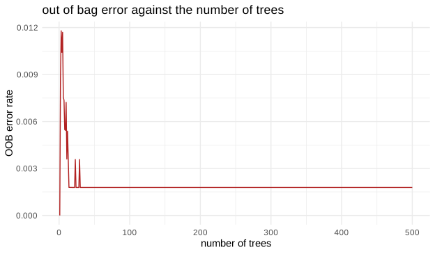
Figure 8.38: the out of bag error stabilizes as trees are added
The curve falls quickly and then flattens. This is an important practical point: adding trees to a forest never causes overfitting, it only stops helping. The number of trees is therefore not a parameter to tune carefully, it is simply taken large enough for the curve to be flat.
The forest also provides a measure of variable importance, obtained by permuting each variable at random and observing how much the accuracy falls. We illustrate it on the regression data of the beginning of the section, where we know which five variables matter.
set.seed(123)
rf_reg <- randomForest(x = X, y = y_reg, ntree = 400, importance = TRUE)

imp <- data.frame(variable = rownames(importance(rf_reg)),
                  importance = importance(rf_reg)[, "%IncMSE"])
imp <- imp[order(-imp$importance), ][1:12, ]

ggplot(imp, aes(reorder(variable, importance), importance)) +
  geom_col(fill = "steelblue") + coord_flip() +
  labs(title = "the twelve most important variables",
       subtitle = "the true model uses v1 to v5", x = "") +
  theme_minimal()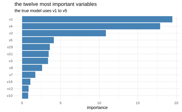
Figure 8.39: the forest recovers the five relevant variables
The five variables that really enter the data generating process stand clearly above the others, and the forest found them without being told anything about the model.
Variable importance must be read with care. It says that a variable is useful for the prediction, not that it has a causal effect, and when two variables are strongly correlated the importance is shared between them in an arbitrary way, so an important variable may hide behind a slightly less important twin. This is one of the places where the econometric reflexes of the previous chapters remain valuable.
8.2.13 ensemble methods
The random forest is one member of a wider family. An ensemble combines several models, called weak learners, into a single stronger one, and the ways of combining them fall into three groups.
Bagging fits the same model on different bootstrap samples and averages the results. Since the models are fitted independently and in parallel, and since averaging reduces the variance without touching the bias, bagging helps models that have high variance, which is exactly the case of deep trees. The random forest is bagging plus the random choice of variables.
Boosting proceeds in the opposite spirit. The models are fitted in sequence, and each one concentrates on the observations that the previous ones got wrong. In gradient boosting, each new tree is fitted to the residuals, or more generally to the gradient of the loss, of the current ensemble:
\[\begin{equation} F_{m}(x)=F_{m-1}(x)+\nu\, h_m(x) \tag{8.44} \end{equation}\]
where \(h_m\) is the new tree and \(\nu\) a learning rate, usually small, which slows the process down and improves the final result. Boosting reduces the bias and therefore works with very shallow trees, sometimes with a single split. Contrary to bagging, it can overfit if too many iterations are performed, so the number of trees is a genuine parameter to tune.
Stacking combines models of different natures, a tree, a linear model, a nearest neighbour rule, by fitting a final model that learns how to weight their predictions. The weights are estimated on predictions produced by cross validation, otherwise the final model would reward those that have memorized the training data.
The following experiment compares a single tree, bagging, a forest and boosting on the same data.
In R:
set.seed(123)

# a small gradient boosting written by hand on the regression data,
# so that the mechanism stays visible
boost_curve <- function(nu = 0.1, M = 300) {
  Fm <- rep(mean(y_reg), length(y_reg))
  Fte <- rep(mean(y_reg), length(y_reg_te))
  out <- numeric(M)
  dtrain <- data.frame(X)
  dtest  <- data.frame(Xte)
  for (m in 1:M) {
    resid <- y_reg - Fm
    h <- rpart(resid ~ ., data = cbind(resid = resid, dtrain),
               control = rpart.control(maxdepth = 2, cp = 0))
    Fm  <- Fm  + nu * predict(h, newdata = dtrain)
    Fte <- Fte + nu * predict(h, newdata = dtest)
    out[m] <- mean((y_reg_te - Fte)^2)
  }
  out
}

bc <- data.frame(iteration = 1:300, test_mse = boost_curve())

ggplot(bc, aes(iteration, test_mse)) +
  geom_line(colour = "firebrick") +
  geom_vline(xintercept = which.min(bc$test_mse), linetype = 2, colour = "grey40") +
  labs(title = "gradient boosting: the test error has a minimum",
       subtitle = "contrary to a forest, continuing too long degrades the model",
       x = "number of boosting iterations", y = "test MSE") +
  theme_minimal()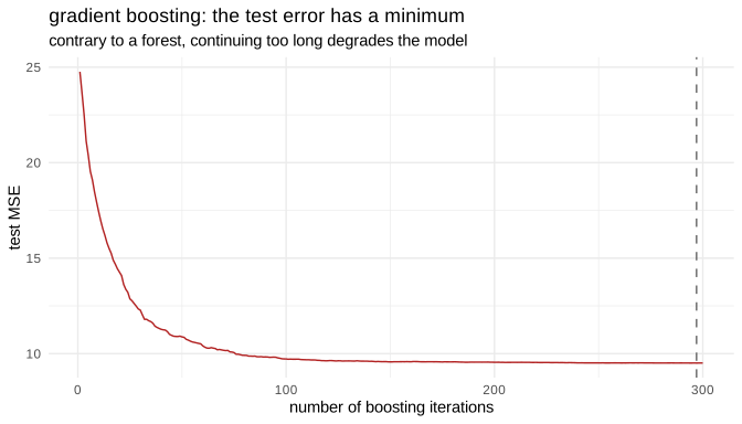
Figure 8.40: how the test error evolves with the number of trees
The contrast with the out of bag curve of the forest is the point of this figure. There the error fell and then stayed flat, here it falls, reaches a minimum and rises again: boosting keeps reducing the bias until it starts fitting the noise. The dashed line marks where the process should have been stopped, and in practice this is done with a validation set, a technique called early stopping.
In Python:
scikit-learn provides the whole family under consistent names, which makes the comparison short to write.
from sklearn.tree import DecisionTreeClassifier
from sklearn.ensemble import (BaggingClassifier, RandomForestClassifier,
                              GradientBoostingClassifier, VotingClassifier)

ens = {
    "single tree": DecisionTreeClassifier(random_state=0),
    "pruned tree": DecisionTreeClassifier(max_depth=3, random_state=0),
    "bagging": BaggingClassifier(DecisionTreeClassifier(random_state=0),
                                 n_estimators=300, random_state=0),
    "random forest": RandomForestClassifier(n_estimators=300, random_state=0),
    "gradient boosting": GradientBoostingClassifier(n_estimators=300, learning_rate=.1,
                                                    max_depth=2, random_state=0),
    "voting (soft)": VotingClassifier(
        estimators=[("qda", QuadraticDiscriminantAnalysis()),
                    ("knn", KNeighborsClassifier(n_neighbors=25)),
                    ("rf", RandomForestClassifier(n_estimators=200, random_state=0))],
        voting="soft"),
}

ens_scores = pd.DataFrame(
    [{"model": k, "test_accuracy": round(accuracy_score(yte_c, m.fit(Xtr_c, ytr_c).predict(Xte_c)), 4)}
     for k, m in ens.items()]
).sort_values("test_accuracy", ascending=False).reset_index(drop=True)| model | test_accuracy |
|---|---|
| bagging | 1.0000 |
| random forest | 1.0000 |
| voting (soft) | 1.0000 |
| single tree | 0.9958 |
| gradient boosting | 0.9958 |
| pruned tree | 0.9458 |
The table is worth reading against expectations rather than with them. Bagging, the forest and the vote reach a perfect score, but the single unpruned tree is already almost perfect, and gradient boosting only matches it. The reason is that this problem is easy once the boundary is allowed to curve: with two features and a clean circular frontier, a deep tree has enough splits to approximate it well, so the ensembles have very little room left to improve on it.
The genuinely informative line is the last one. The pruned tree, limited to a depth of three, is the worst model of the table by a clear margin. On these data underfitting costs much more than overfitting, which is the opposite of the usual warning and a reminder that the trade-off has no universal direction: it depends on where the model sits relative to the complexity that the problem actually requires.
The differences between the ensembles themselves should therefore not be over-interpreted here. On harder data, with many features and a noisier boundary, the gap between a single tree and an ensemble widens considerably, and boosting usually takes the lead over bagging, at the price of more careful tuning.